
Creating SPSS stacked bar charts with percentages -as shown above- is pretty easy. However, figuring out the right steps may take quite some effort and frustration. This tutorial therefore shows how to do it properly in one go.
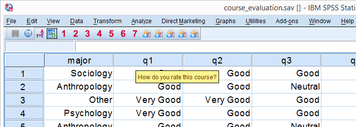
We encourage you to follow along on course_evaluation.sav. Part of these data are shown in the screenshot below.
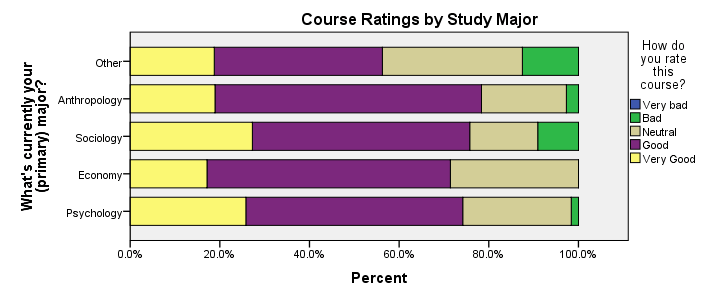
Example: Course Rating by Study Major
Let's say we'd like to visualize the association between study major (nominal) and overall course rating (ordinal). A table that gives us some insight is a contingency table showing column percentages. We'll create it by running the syntax below.
set tnumbers labels tvars labels.
*Crosstab with column percentages.
crosstabs q1 by major
/cells column.
Result
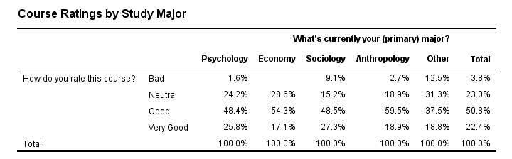
Our course was least popular with students studying some “Other” study major. Can you tell which students like our course most?
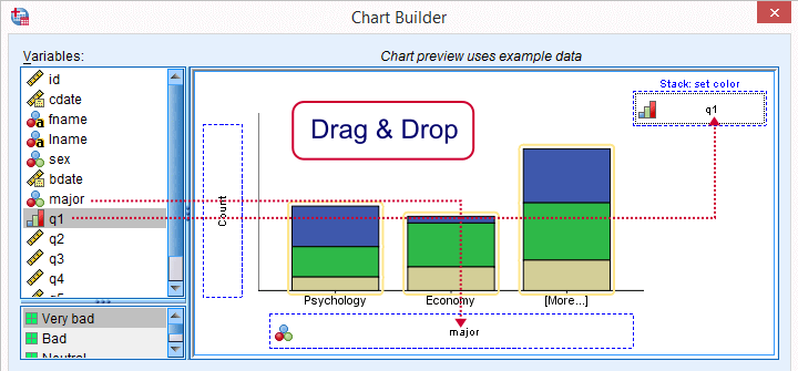
Anyway, it's exactly this table that we'll visualize as a chart. We'll do so by following the next five screenshots.
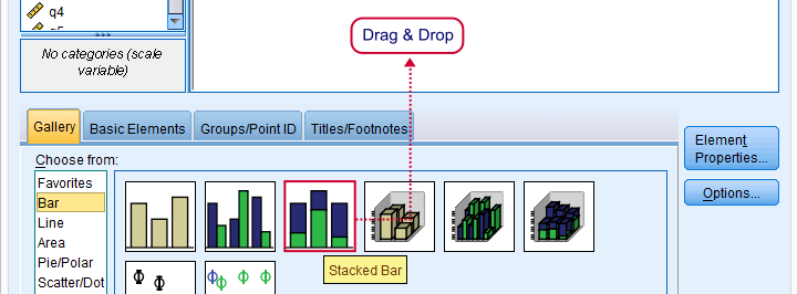
SPSS Chart Builder Dialogs
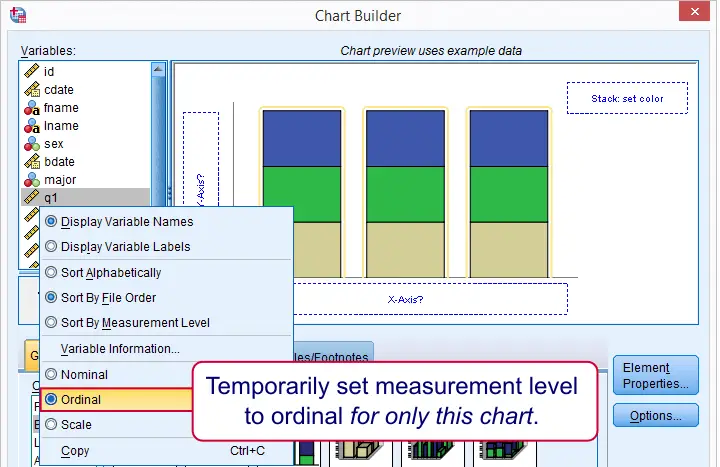
Our stacked bar chart requires setting measurement levels to nominal or ordinal. You could do so before opening the chart builder (possibly preceded by TEMPORARY) or within the chart builder. When using this second option, the chosen measurement levels apply only to the chart you're creating.
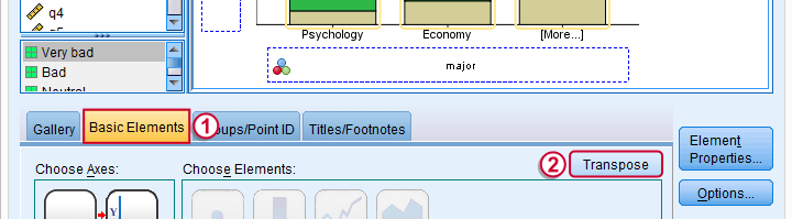
sort of rotates our chart by 90 degrees and thus changes the chart layout from vertical to horizontal. This isn't necessary but the horizontal layout is usually much more suitable for all sorts of bar charts than the default vertical layout.
Two options for transposing charts are 1) in the chart builder as we do now or 2) by applying an SPSS chart template.
 Don't forget to “Apply” here -like I always do.
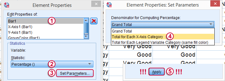
The steps in the screenshot above show the steps for selecting the right percentages for this chart. Don't forget to click whenever changing something in the Element Properties dialog (we forget it all the time).
 And again: “Apply”.
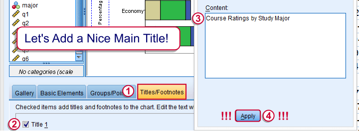
Optionally, set a main title for the chart and it. Clicking results in the syntax below. Let's run it.
SPSS Stacked Bar Chart Syntax
GGRAPH
/GRAPHDATASET NAME="graphdataset" VARIABLES=major COUNT()[name="COUNT"] q1[LEVEL=ORDINAL]
MISSING=LISTWISE REPORTMISSING=NO
/GRAPHSPEC SOURCE=INLINE.
BEGIN GPL
SOURCE: s=userSource(id("graphdataset"))
DATA: major=col(source(s), name("major"), unit.category())
DATA: COUNT=col(source(s), name("COUNT"))
DATA: q1=col(source(s), name("q1"), unit.category())
COORD: rect(dim(1,2), transpose())
GUIDE: axis(dim(1), label("What's currently your (primary) major?"))
GUIDE: axis(dim(2), label("Percent"))
GUIDE: legend(aesthetic(aesthetic.color.interior), label("How do you rate this course?"))
GUIDE: text.title(label("Course Ratings by Study Major"))
SCALE: cat(dim(1), include("1", "2", "3", "4", "5"))
SCALE: linear(dim(2), include(0))
SCALE: cat(aesthetic(aesthetic.color.interior), include("1", "2", "3", "4", "5"))
ELEMENT: interval.stack(position(summary.percent(major*COUNT, base.coordinate(dim(1)))),
color.interior(q1), shape.interior(shape.square))
END GPL.
Unstyled Stacked Bar Chart
First, note that “Very bad” appears in our legend even though it's not present in our data. By default, the Chart Builder includes all values for which value labels are present regardless whether they are present in the data. This can be very annoying: any categories you excluded with FILTER now reappear in your chart.
Second, our chart looks terrible (however, see New Charts in SPSS 25 - How Good Are They Really?). However, a chart template is a great way to fix that. The end result is shown below.
Styled Stacked Bar Chart
Unfortunately, our chart doesn't show any association at all -a bit of an anticlimax after all the work. But I hope you'll have more luck with your charts!
Thanks for reading!
THIS TUTORIAL HAS 12 COMMENTS:
By Charles on August 4th, 2021
I need moderation for my stack ( ). How do I run SPSS using the i variable.
By Mars Marga on September 21st, 2021
Is that possible to get the guideline and data set for all those examples