SPSS FREQUENCIES command can be used for much more than frequency tables: it's also the easiest way to obtain basic charts such as histograms and bar charts. On top of that, it provides us with percentiles and some other statistics. Plenty of reasons for taking a closer look at this ubiquitous SPSS command. We'll use employees.sav throughout this tutorial.
SPSS FREQUENCIES - Basic Table
The most basic way to use FREQUENCIES is simply generating a frequency table. For example, the frequency table for job_type is obtained by running the following line of SPSS syntax: frequencies job_type.
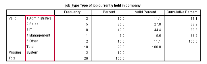
By default, the rows of this table are sorted ascendingly by value. Note that this may not be obvious when only value labels are displayed. We'll next take a look at different options for sorting the table rows.
SPSS FREQUENCIES - Sort Order
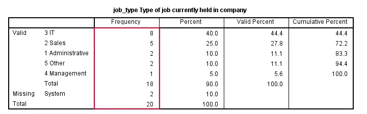
SPSS default sort order of ascendingly be value can be changed by adding a FORMAT subcommand. Possible values are AVALUE and DVALUE (ascending and descending values) or AFREQ and DFREQ (ascending and descending frequencies). For example, the syntax below sorts the rows from the value with highest frequency (yes, that's the mode) through the value with the lowest frequency.
frequencies job_type
/format dfreq.
SPSS FREQUENCIES - Bar Chart
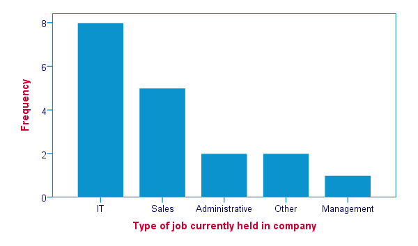
SPSS FREQUENCIES command is the easiest way to create one or more bar charts for categorical variables. Just add the BARCHART subcommand. Note that you can combine it with a sort order, resulting in the barchart bars being ordered from highest through lowest frequency as shown below.
frequencies job_type
/format dfreq
/barchart.
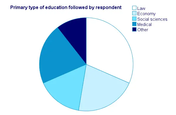
SPSS FREQUENCIES - Pie Chart
An alternative visualization for categorical variables is a pie chart. In order to generate it, simply add a PIECHART subcommand to FREQUENCIES. The syntax below creates a pie chart for education_type.
frequencies education_type
/piechart.
SPSS FREQUENCIES - Histogram
Frequency tables, bar charts and pie charts can all be used for both metric as well as categorical variables, including string variables. However, they are not useful for metric variables with many distinct values; in this case, tables get too many rows and graphs too many elements.
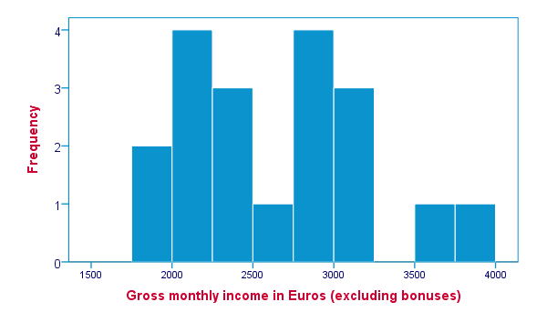
The ideal way to visualize such variables is a histogram, obtained by the HISTOGRAM subcommand. Apart from that, we can suppress frequency tables by specifying NOTABLE on the FORMAT subcommand. Like so, the syntax below generates a histogram for monthly_income.
frequencies monthly_income
/format notable
/histogram.
SPSS FREQUENCIES - Percentiles
SPSS FREQUENCIES provides a nice way to obtain percentiles: just add a PERCENTILES subcommand followed by the desired percentiles in parentheses. The syntax below gives an example. Keep in mind that percentiles are not meaningful for nominal variables.
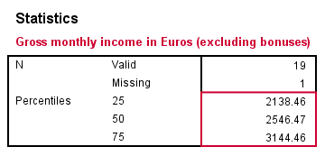
frequencies monthly_income
/format notable
/percentiles (25 50,75).
SPSS FREQUENCIES - Ntiles
Ntiles are easily obtained with SPSS FREQUENCIES: simply add the NTILES subcommand with the number of ntiles behind it in parentheses. If you want to assign cases to ntile groups, use RANK; it creates a new variable holding the ntile for each case on a given variable. Both options are shown in the syntax below.
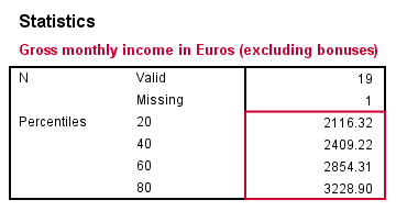
frequencies monthly_income
/format notable
/ntiles (5).
*2. Create monthly_income ntile group variable in data.
rank monthly_income/ntiles(5).
SPSS FREQUENCIES - Statistics
SPSS FREQUENCIES can compute all statistics obtained from DESCRIPTIVES plus the median and mode. Note that the statistics table from FREQUENCIES has a different layout with variables in columns and statistics in rows. For obtaining them, add a STATISTICS subcommand. Just as with DESCRIPTIVES, specifying the ALL keyword returns all available statistics.
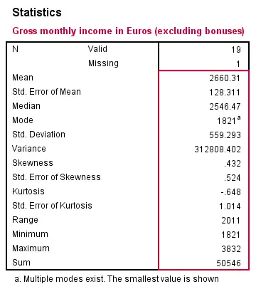
frequencies monthly_income
/format notable
/statistics all.
SPSS FREQUENCIES - Multiple Variables
Obviously, FREQUENCIES can be run for multiple variables, possibly using TO or ALL. If multiple types of output (frequency table, chart and so on) are generated, you can have them sorted by variable or output type by specifying VARIABLE or ANALYSIS on an ORDER subcommand.
frequencies education_type to job_type
/format dfreq
/barchart
/order variable.
*2. Sort output by output type (first tables for all variables, then charts for all variables).
frequencies education_type to job_type
/format dfreq
/barchart
/order analysis.
THIS TUTORIAL HAS 15 COMMENTS:
By Ruben Geert van den Berg on August 15th, 2016
Hi Josh! Interesting question. I'm not sure if it's possible with the MULT RESP command but there may be other ways. Or perhaps Python scripting. Or perhaps find a fast and easy way for modifying your values. Could you share some (fake) data and syntax you're currently using?
By Ines Kondor on July 26th, 2017
Hi Ruben, thanks for this excellent tutorial.
Would you perhaps know if/how we can avoid showing BOTH the "valid percent" and "percent" columns? (In my case, luckily valid % = % and so the additional column is more confusing than helpful).
Also it would be great if the "Valid" label on the left side could be avoided syntax-wise ?
And - same question Josh raised earlier - I would also be interested in automatically (syntax) sorting the rows in multi-response tables. So far, I have edited each of the resulting table manually - Double-click - highlight a cell - sort by group.
Many thanks again, -- Ines
By Ruben Geert van den Berg on July 26th, 2017
Hi Ines!
I totally agree with your remarks on the FREQUENCIES table format. I believe your desired table could be run with CTABLES but you'll need an additional (custom tables) license for it. It would also require rather long, challenging syntax that takes only one variable at the time. You could wrap it up in Python and run it from a custom dialog, however.
You can hide table rows with a Python tool I built but you can't hide the "Valid" column because it's technically a dimension. I discussed precisely this issue with Jon Peck (officially retired but still quite active for IBM SPSS) but this didn't result in a nice solution -not yet anyway.
An alternative could be adding a constant to your data and running CROSSTABS although I haven't experimented a lot with that.
Editing MR tables manually sounds like a terrible waste of time. I don't think there's any easy solution for this one. I could perhaps build a tool that does the trick with one line of syntax but it would probably take me some hours and I'd need to have those covered. If I could have a sample of data and the desired end result, I can make a precise estimate of the costs for it.
Hope that helps!
By Ines Kondor on July 27th, 2017
Thanks a lot for your super fast and comprehensive response(s), Ruben. Much appreciated :-)
By William Peck on November 14th, 2018
Whoa! I googled sorting on the frequencies command and you popped up first! And right on the money :-)