- Example Data
- VARSTOCASES without VARSTOCASES
- Restructuring the Data
- SPSS Chart Builder - Basic Steps
- Final Result
This tutorial shows how to create the clustered bar chart shown below in SPSS. As this requires restructuring our data, we'll first do so with a seriously cool trick.

Example Data
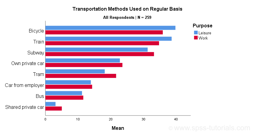
A sample of N = 259 respondents were asked “which means of transportation do you use on a regular basis?” Respondents could select one or more means of transportation for both work and leisure related travelling. The data thus obtained are in transportation.sav, partly shown below.
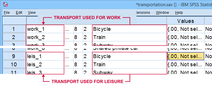
Note that our data consist of 2 sets (work and leisure) of 8 dichotomous variables (transportation options). For creating our chart, we need to stack these 2 sets vertically. The usual way to do so is with VARSTOCASES as illustrated below.
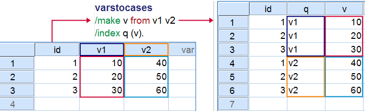
Now, we could use VARSTOCASES for our data but we find this rather tedious for 8 variables. We'll replace it with a trick that creates nicer results and requires less syntax too.
VARSTOCASES without VARSTOCASES
The screenshots below illustrate how to mimic VARSTOCASES without needing its syntax.
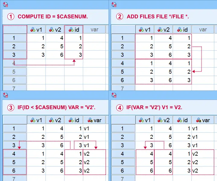
This method saves more effort insofar as you stack more variables: placing the IF command in step  in a DO REPEAT loop does the trick.
Restructuring the Data
Let's now run these steps on transportation.sav with the syntax below. If you're not sure about some command, you can inspect its result in data view if you run EXECUTE right after it.
descriptives all.
*Add id to dataset.
compute id = $casenum.
*Vertically stack dataset onto itself.
add files file */file *.
*Identify copied cases.
compute Purpose = ($casenum > id).
value labels Purpose 0 'Work' 1 'Leisure'.
*Shift values from leisure into work variables.
do repeat #target = work_1 to work_8 / #source = leis_1 to leis_8.
if(purpose) #target = #source.
end repeat.
*Create checktable 2.
means work_1 to work_8 by Purpose.
If everything went right, the 2 checktables will show the exact same information.
Final Data Adjustments
Our data now have the structure required for running our chart. However, a couple of adjustments are still desirable:
- since we want to see percentages instead of proportions, we'll RECODE our 0-1 variables into 0-100;
- next, FORMATS adds percent signs to the recoded values;
- the Chart Builder only computes means over quantitative variables. We'll therefore set all measurement levels to scale;
- we'll remove a couple of variables that have become redundant.
recode work_1 to work_8 (1 = 100).
*Set formats to percentages.
formats work_1 to work_8 (pct8).
*Set measurement levels (needed for SPSS chart builder & Custom Tables).
variable level work_1 to work_8 (scale).
*Remove (now) redundant variables.
add files file */drop leis_1 to id.
SPSS Chart Builder - Basic Steps
The screenshot below sketches some basic steps that'll result in our chart.
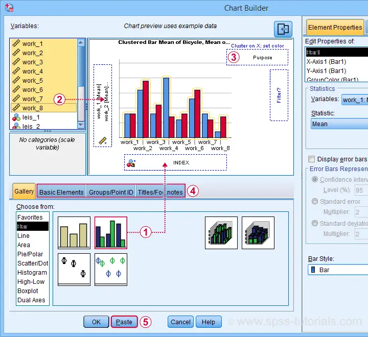
 drag and drop the clustered bar chart onto the canvas;
 select, drag and drop all outcome variables in one go into the y-axis box. Click “Ok” in the dialog that pops up;
 drag “Purpose” (leisure or work) into the Color box;
go through these tabs, select “Transpose” and choose some title and subtitle for the chart;
 clicking results in the syntax below.
GGRAPH
/GRAPHDATASET NAME="graphdataset" VARIABLES=MEAN(work_1) MEAN(work_2) MEAN(work_3) MEAN(work_4)
MEAN(work_5) MEAN(work_6) MEAN(work_7) MEAN(work_8) Purpose MISSING=LISTWISE REPORTMISSING=NO
TRANSFORM=VARSTOCASES(SUMMARY="#SUMMARY" INDEX="#INDEX")
/GRAPHSPEC SOURCE=INLINE.
BEGIN GPL
SOURCE: s=userSource(id("graphdataset"))
DATA: SUMMARY=col(source(s), name("#SUMMARY"))
DATA: INDEX=col(source(s), name("#INDEX"), unit.category())
DATA: Purpose=col(source(s), name("Purpose"), unit.category())
COORD: rect(dim(1,2), transpose(), cluster(3,0))
GUIDE: axis(dim(2), label("Mean"))
GUIDE: legend(aesthetic(aesthetic.color.interior), label("Purpose"))
GUIDE: text.title(label("Transportation Methods Used on Regular Basis"))
GUIDE: text.subsubtitle(label("All Respondents | N = 259"))
SCALE: cat(dim(3), reverse(), include("0", "1", "2", "3", "4", "5", "6", "7"))
SCALE: linear(dim(2), include(0))
SCALE: cat(aesthetic(aesthetic.color.interior), reverse(), include("0.00", "1.00"))
SCALE: cat(dim(1), include("0.00", "1.00"))
ELEMENT: interval(position(Purpose*SUMMARY*INDEX), color.interior(Purpose),
shape.interior(shape.square))
END GPL.
Initial Result
Whoomp! There it is. We created the chart we were looking for. Sadly, it doesn't look too great:
- despite setting all variable formats to PCT4 (percentages with zero decimal places), percent signs are missing from the x-axis;
- the x-axis is labeled “Mean” instead of “Percentage”;
- the chart doesn't show gridlines.
All such issues can be fixed in the Chart Editor which opens if we double-click our chart. A nicer option, though, is developing and applying a chart template. Our final result after doing so is shown below.
Final Result
Right. This tutorial has been pretty heavy on syntax but I hope you got the hang of it. Were you (not) able to recreate our chart? Do you have any other feedback? Please throw us a comment below.
Thanks for reading!
THIS TUTORIAL HAS 9 COMMENTS:
By Orondo John on May 19th, 2022
Great step in development of SPSS statistics..thnks very much.. blessings
By Glory eneh on June 19th, 2022
Sincerely, this explanation is too unclear. I can't even recreate this at all. It's just not understandable
By Marsa Merga Debela on June 2nd, 2023
How can I do this bar chart without using synthax
By Ruben Geert van den Berg on June 2nd, 2023
Don't.
Whatever you do without SPSS syntax can't be replicated.
So why should anybody believe your results if they can't replicate them?
Anybody who does is a crappy scientist.
SPSS without syntax is worthless. It'll get you absolutely nowhere.
Stop wasting your time on such garbage.