SPSS Mediation Analysis – The Complete Guide
- How to Examine Mediation Effects?
- SPSS Regression Dialogs
- SPSS Mediation Analysis Output
- APA Reporting Mediation Analysis
- Next Steps - The Sobel Test
- Next Steps - Index of Mediation
Example
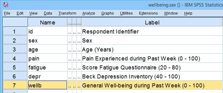
A scientist wants to know which factors affect general well-being among people suffering illnesses. In order to find out, she collects some data on a sample of N = 421 cancer patients. These data -partly shown below- are in wellbeing.sav.
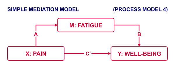
Now, our scientist believes that well-being is affected by pain as well as fatigue. On top of that, she believes that fatigue itself is also affected by pain. In short: pain partly affects well-being through fatigue. That is, fatigue mediates the effect from pain onto well-being as illustrated below.
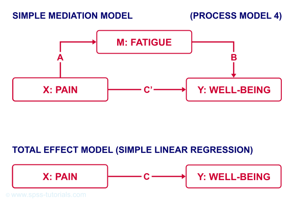
The lower half illustrates a model in which fatigue would (erroneously) be left out. This is known as the “total effect model” and is often compared with the mediation model above it.
How to Examine Mediation Effects?
Now, let's suppose for a second that all expectations from our scientist are exactly correct. If so, then what should we see in our data? The classical approach to mediation (see Kenny & Baron, 1986) says that
- \(a\) (from pain to fatigue) should be significant;
- \(b\) (from fatigue to well-being) should be significant;
- \(c\) (from pain to well-being) should be significant;
- \(c\,'\) (direct effect) should be closer to zero than \(c\) (total effect).
So how to find out if our data is in line with these statements? Well, all paths are technically just b-coefficients. We'll therefore run 3 (separate) regression analyses:
- regression from pain onto fatigue tells us if \(a\) is significant;
- multiple linear regression from pain and fatigue onto well-being tells us if \(b\) and \(c\,'\) are significant;
- regression from pain onto well-being tells if \(c\) is significant and/or different from \(c\,'\).
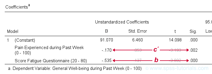 Paths c’ and b in basic SPSS regression output
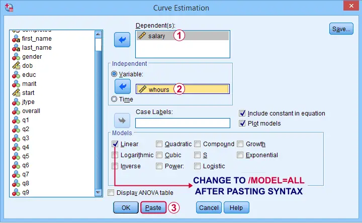
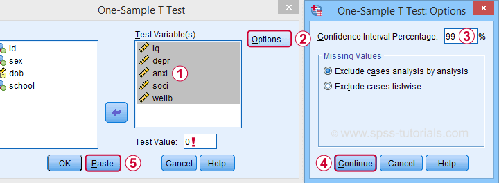
SPSS Regression Dialogs
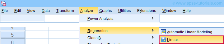
So let's first run the regression analysis for effect \(a\) (X onto mediator) in SPSS: we'll open wellbeing.sav and navigate to the linear regression dialogs as shown below.
For a fairly basic analysis, we'll fill out these dialogs as shown below.
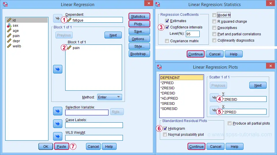
Completing these steps results in the SPSS syntax below. I suggest you shorten the pasted version a bit.
REGRESSION
/MISSING LISTWISE
/STATISTICS COEFF OUTS CI(95) R ANOVA
/CRITERIA=PIN(.05) POUT(.10)
/NOORIGIN
/DEPENDENT fatigue /* MEDIATOR */
/METHOD=ENTER pain /* X */
/SCATTERPLOT=(*ZRESID ,*ZPRED)
/RESIDUALS HISTOGRAM(ZRESID).
*SHORTEN TO SOMETHING LIKE...
REGRESSION
/STATISTICS COEFF CI(95) R
/DEPENDENT fatigue /* MEDIATOR */
/METHOD=ENTER pain /* X */
/SCATTERPLOT=(*ZRESID ,*ZPRED)
/RESIDUALS HISTOGRAM(ZRESID).
A second regression analysis estimates effects \(b\) and \(c\,'\). The easiest way to run it is to copy, paste and edit the first syntax as shown below.
REGRESSION
/STATISTICS COEFF CI(95) R
/DEPENDENT wellb /* Y */
/METHOD=ENTER pain fatigue /* X AND MEDIATOR */
/SCATTERPLOT=(*ZRESID ,*ZPRED)
/RESIDUALS HISTOGRAM(ZRESID).
We'll use the syntax below for the third (and final) regression which estimates \(c\), the total effect.
REGRESSION
/STATISTICS COEFF CI(95) R
/DEPENDENT wellb /* Y */
/METHOD=ENTER pain /* X */
/SCATTERPLOT=(*ZRESID ,*ZPRED)
/RESIDUALS HISTOGRAM(ZRESID).
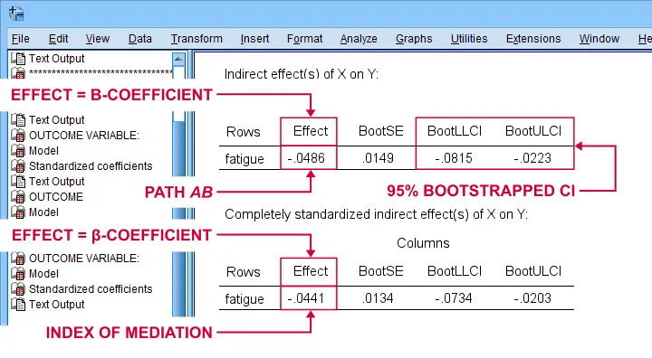
SPSS Mediation Analysis Output
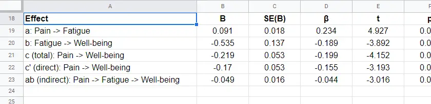
For our mediation analysis, we really only need the 3 coefficients tables. I copy-pasted them into this Googlesheet (read-only, partly shown below).
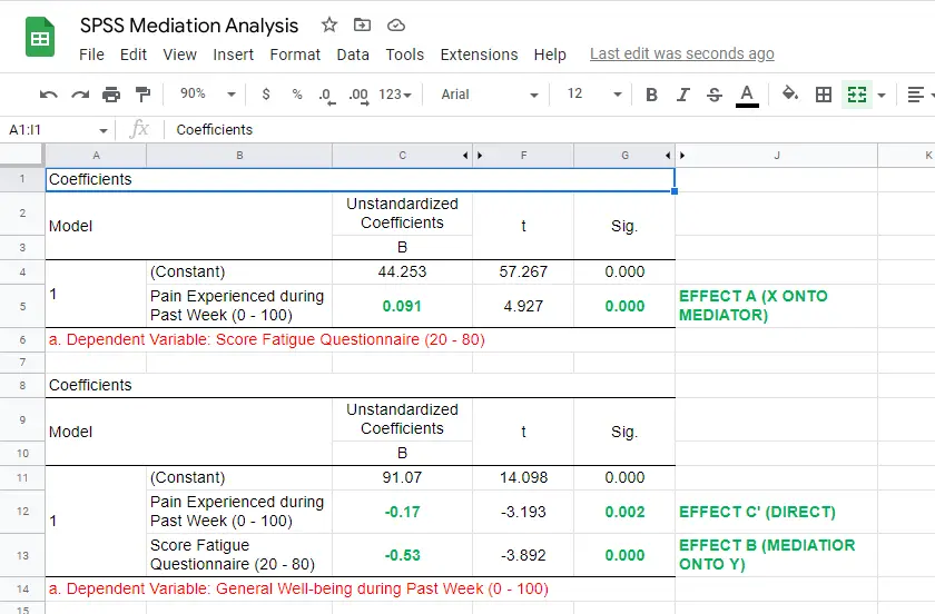
So what do we conclude? Well, all requirements for mediation are met by our results:
- effects \(a\), \(b\) and \(c\) are all statistically significant. This is because their “Sig.” or p < .05;
- the direct effect \(c\,'\) = -0.17 and thus closer to zero than the total effect \(c\) = -0.22.
The diagram below summarizes these results.
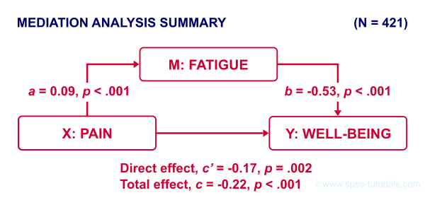
Note that both \(c\) and \(c\,'\) are significant. This is often called partial mediation: fatigue partially mediates the effect from pain onto well-being: adding it decreases the effect but doesn't nullify it altogether.
Besides partial mediation, we sometimes find full mediation. This means that \(c\) is significant but \(c\,'\) isn't: the effect is fully mediated and thus disappears when the mediator is added to the regression model.
APA Reporting Mediation Analysis
Mediation analysis is often reported as separate regression analyses as in “the first step of our analysis showed that the effect of pain on fatigue was significant, b = 0.09, p < .001...” Some authors also include t-values and degrees of freedom (df) for b-coefficients. For some very dumb reason, SPSS does not report degrees of freedom but you can compute them as
$$df = N - k - 1$$
where
- \(N\) denotes the total sample size (N = 421 in our example) and
- \(k\) denotes the number of predictors in the model (1 or 2 in our example).
Like so, we could report “the second step of our analysis showed that the effect of fatigue on well-being was also significant, b = -0.53, t(419) = -3.89, p < .001...”
Next Steps - The Sobel Test
In our analysis, the indirect effect of pain via fatigue onto well-being consists of two separate effects, \(a\) (pain onto fatigue) and \(b\) fatigue onto well-being. Now, the entire indirect effect \(ab\) is simply computed as
$$\text{indirect effect} \;ab = a \cdot b$$
This makes perfect sense: if wage \(a\) is $30 per hour and tax \(b\) is $0.20 per dollar income, then I'll pay $30 · $0.20 = $6.00 tax per hour, right?
For our example, \(ab\) = 0.09 · -0.53 = -0.049: for every unit increase in pain, well-being decreases by an average 0.049 units via fatigue. But how do we obtain the p-value and confidence interval for this indirect effect? There's 2 basic options:
- the modern literature favors bootstrapping as implemented in the PROCESS macro which we'll discuss later;
- the Sobel test (also known as “normal theory” approach).
The second approach assumes \(ab\) is normally distributed with
$$se_{ab} = \sqrt{a^2se^2_b + b^2se^2_a + se^2_a se^2_b}$$
where
\(se_{ab}\) denotes the standard error of \(ab\) and so on.
For the actual calculations, I suggest you try our Sobel Test Calculator.xlsx, partly shown below.
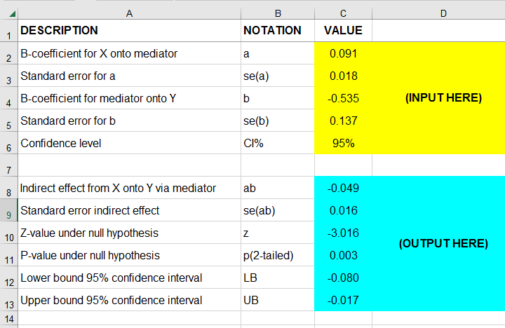
So what does this tell us? Well, our indirect effect is significant, B = -0.049, p = .002, 95% CI [-0.08, -0.02].
Next Steps - Index of Mediation
Our research variables (such as pain & fatigue) were measured on different scales without clear units of measurement. This renders it impossible to compare their effects. The solution is to report standardized coefficients known as β (Greek letter “beta”).
Our SPSS output already includes beta for most effects but not for \(ab\). However, we can easily compute it as
$$\beta_{ab} = \frac{ab \cdot SD_x}{SD_y}$$
where
\(SD_x\) is the sample-standard-deviation of our X variable and so on.
This standardized indirect effect is known as the index of mediation. For computing it, we may run something like DESCRIPTIVES pain wellb. in SPSS. After copy-pasting the resulting table into this Googlesheet, we'll compute \(\beta_{ab}\) with a quick formula as shown below.
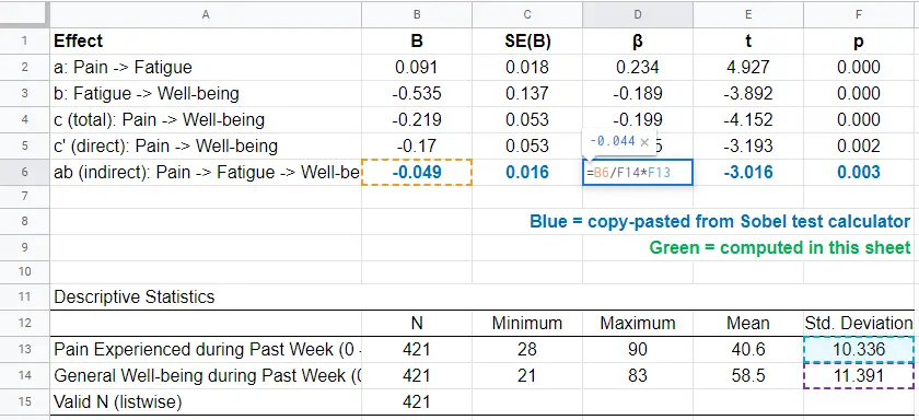
Adding the output from our Sobel test calculator to this sheet results in a very complete and clear summary table for our mediation analysis.
Final Notes
Mediation analysis in SPSS can be done with or without the PROCESS macro. Some reasons for not using PROCESS are that
- many people find PROCESS difficult to use and dislike its output format;
- PROCESS can't create regression residuals and the associated plots for checking regression assumptions such as linearity, homoscedasticity and normality;
- the PROCESS output does not include adjusted r-squared;
- PROCESS does not offer pairwise exclusion of missing values.
So why does anybody use PROCESS? Some reasons may be that
- PROCESS uses bootstrapping rather than the Sobel test. This is said to result in higher power and more accurate confidence intervals. Sadly, bootstrapping does not yield a p-value for the indirect effect whereas the Sobel test does;
- using PROCESS may save a lot of work for more complex models (parallel, serial and moderated mediation);
- if needed, PROCESS handles dummy coding for the X variable and moderators (if any);
- PROCESS doesn't require the additional calculations that we implemented in our Googlesheet: it calculates everything you need in one go.
Right. I hope this tutorial has been helpful for running, reporting and understanding mediation analysis in SPSS. This is perhaps not the easiest topic but remember that practice makes perfect.
Thanks for reading!
How to Draw Regression Lines in SPSS?
- Method A - Legacy Dialogs
- Method B - Chart Builder
- Method C - CURVEFIT
- Method D - Regression Variable Plots
- Method E - All Scatterplots Tool
Summary & Example Data
This tutorial walks you through different options for drawing (non)linear regression lines for either all cases or subgroups. All examples use bank-clean.sav, partly shown below.
Method A - Legacy Dialogs
A simple option for drawing linear regression lines is found under
![]()
![]() as illustrated by the screenshots below.
as illustrated by the screenshots below.
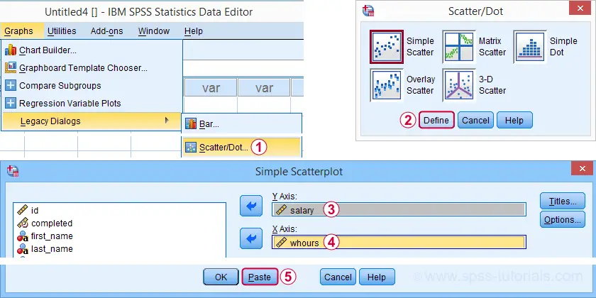
Completing these steps results in the SPSS syntax below. Running it creates a scatterplot to which we can easily add our regression line in the next step.
GRAPH
/SCATTERPLOT(BIVAR)=whours WITH salary
/MISSING=LISTWISE.
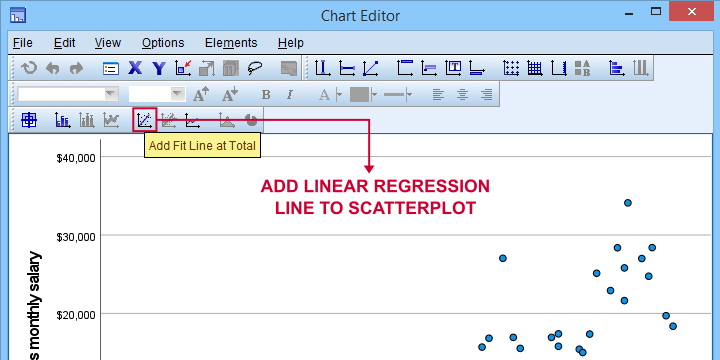
For adding a regression line, first double click the chart to open it in a Chart Editor window. Next, click the “Add Fit Line at Total” icon as shown below.
You can now simply close the fit line dialog and Chart Editor.
Result
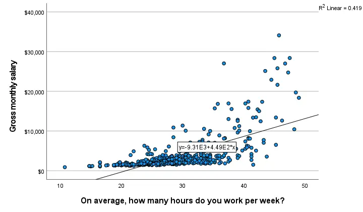
The linear regression equation is shown in the label on our line: y = 9.31E3 + 4.49E2*x which means that
$$Salary' = 9,310 + 449 \cdot Hours$$
Note that 9.31E3 is scientific notation for 9.31 · 103 = 9,310 (with some rounding).
You can verify this result and obtain more detailed output by running a simple linear regression from the syntax below.
regression
/dependent salary
/method enter whours.
When doing so, you'll also have significance levels and/or confidence intervals. Finally, note that a linear relation seems a very poor fit for these variables. So let's explore some more interesting options.
Method B - Chart Builder
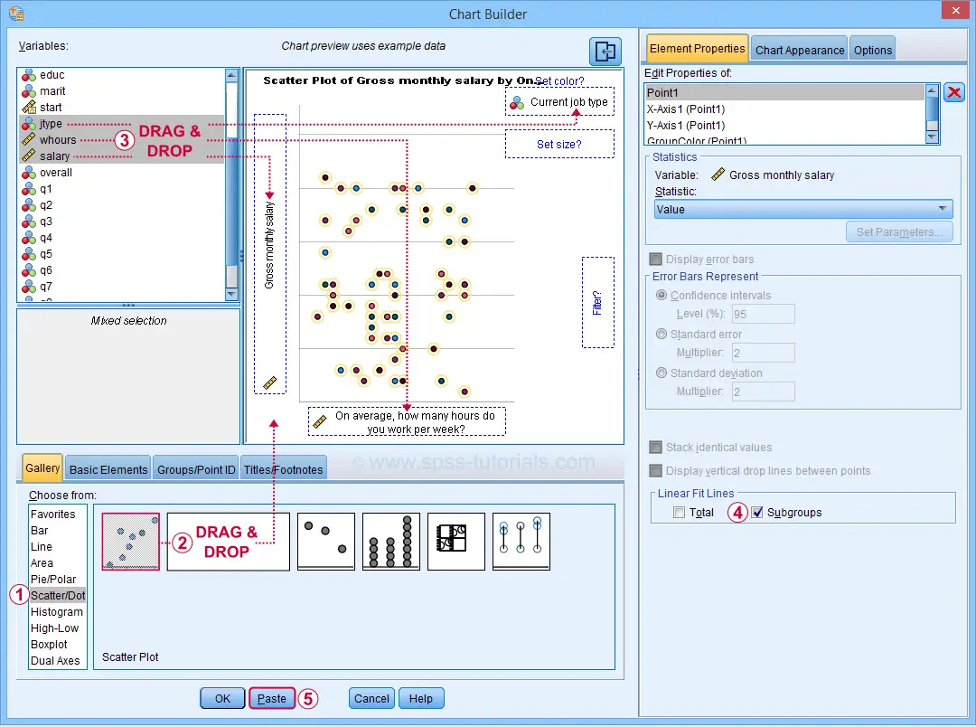
For SPSS versions 25 and higher, you can obtain scatterplots with fit lines from the chart builder. Let's do so for job type groups separately: simply navigate to
![]() and fill out the dialogs as shown below.
and fill out the dialogs as shown below.
This results in the syntax below. Let's run it.
GGRAPH
/GRAPHDATASET NAME="graphdataset" VARIABLES=whours salary jtype MISSING=LISTWISE REPORTMISSING=NO
/GRAPHSPEC SOURCE=INLINE
/FITLINE TOTAL=NO SUBGROUP=YES.
BEGIN GPL
SOURCE: s=userSource(id("graphdataset"))
DATA: whours=col(source(s), name("whours"))
DATA: salary=col(source(s), name("salary"))
DATA: jtype=col(source(s), name("jtype"), unit.category())
GUIDE: axis(dim(1), label("On average, how many hours do you work per week?"))
GUIDE: axis(dim(2), label("Gross monthly salary"))
GUIDE: legend(aesthetic(aesthetic.color.interior), label("Current job type"))
GUIDE: text.title(label("Scatter Plot of Gross monthly salary by On average, how many hours do ",
"you work per week? by Current job type"))
SCALE: cat(aesthetic(aesthetic.color.interior), include(
"1", "2", "3", "4", "5"))
ELEMENT: point(position(whours*salary), color.interior(jtype))
END GPL.
Result
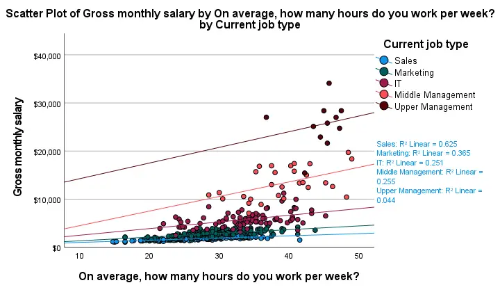
First off, this chart is mostly used for
- inspecting homogeneity of regression slopes in ANCOVA and
- simple slopes analysis in moderation regression.
Sadly, the styling for this chart is awful but we could have fixed this with a chart template if we hadn't been so damn lazy.
Anyway, note that R-square -a common effect size measure for regression- is between good and excellent for all groups except upper management. This handful of cases may be the main reason for the curvilinearity we see if we ignore the existence of subgroups.
Running the syntax below verifies the results shown in this plot and results in more detailed output.
sort cases by jtype.
split file layered by jtype.
*SIMPLE LINEAR REGRESSION.
regression
/dependent salary
/method enter whours.
*END SPLIT FILE.
split file off.
Method C - CURVEFIT
Scatterplots with (non)linear fit lines and basic regression tables are very easily obtained from CURVEFIT. Jus navigate to
![]()
![]() and fill out the dialog as shown below.
and fill out the dialog as shown below.
If you'd like to see all models, change /MODEL=LINEAR to /MODEL=ALL after pasting the syntax.
TSET NEWVAR=NONE.
CURVEFIT
/VARIABLES=salary WITH whours
/CONSTANT
/MODEL=ALL /* CHANGE THIS LINE MANUALLY */
/PLOT FIT.
Result
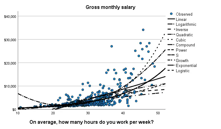
Despite the poor styling of this chart, most curves seem to fit these data better than a linear relation. This can somewhat be verified from the basic regression table shown below.
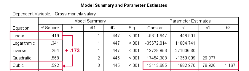
Especially the cubic model seems to fit nicely. Its equation is
$$Salary' = -13114 + 1883 \cdot hours - 80 \cdot hours^2 + 1.17 \cdot hours^3$$
Sadly, this output is rather limited: do all predictors in the cubic model seriously contribute to r-squared? The syntax below results in more detailed output and verifies our initial results.
compute whours2 = whours**2.
compute whours3 = whours**3.
regression
/dependent salary
/method forward whours whours2 whours3.
Method D - Regression Variable Plots
Regression Variable Plots is an SPSS extension that's mostly useful for
- creating several scatterplots and/or fit lines in one go;
- plotting nonlinear fit lines for separate groups;
- adding elements to and customizing these charts.
I believe this extension is preinstalled with SPSS version 26 onwards. If not, it's supposedly available from STATS_REGRESS_PLOT but I used to have some trouble installing it on older SPSS versions.
Anyway: if installed, navigating to
![]() should open the dialog shown below.
should open the dialog shown below.
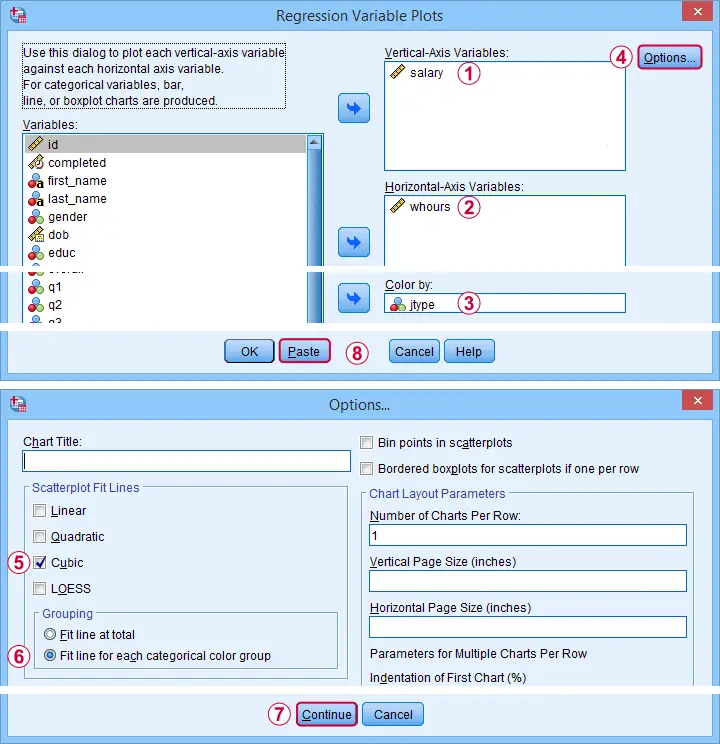
Completing these steps results in the syntax below. Let's run it.
STATS REGRESS PLOT YVARS=salary XVARS=whours COLOR=jtype
/OPTIONS CATEGORICAL=BARS GROUP=1 INDENT=15 YSCALE=75
/FITLINES CUBIC APPLYTO=GROUP.
Result
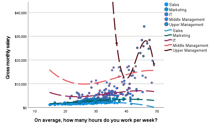
Most groups don't show strong deviations from linearity. The main exception is upper management which shows a rather bizarre curve.
However, keep in mind that these are only a handful of observations; the curve is the result of overfitting. It (probably) won't replicate in other samples and can't be taken seriously.
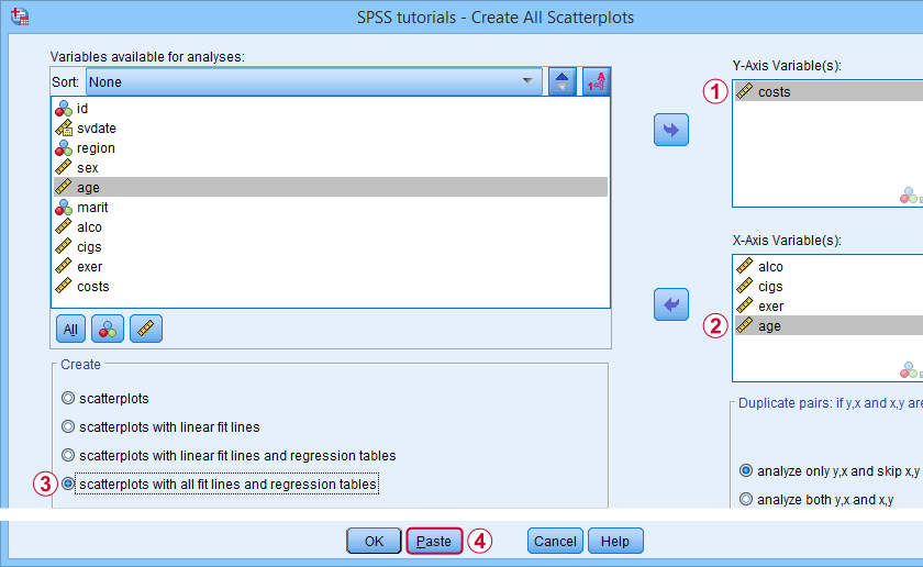
Method E - All Scatterplots Tool
Most methods we discussed so far are pretty good for creating a single scatterplot with a fit line. However, we often want to check several such plots for things like outliers, homoscedasticity and linearity. This is especially relevant for
A very simple tool for precisely these purposes is downloadable from and discussed in SPSS - Create All Scatterplots Tool.
Final Notes
Right, so those are the main options for obtaining scatterplots with fit lines in SPSS. I hope you enjoyed this quick tutorial as much as I have.
If you've any remarks, please throw me a comment below. And last but not least:
thanks for reading!
SPSS Mediation Analysis with PROCESS
- SPSS PROCESS Dialogs
- SPSS PROCESS Output
- Mediation Summary Diagram & Conclusion
- Indirect Effect and Index of Mediation
- APA Reporting Mediation Analysis
Introduction
A study investigated general well-being among a random sample of N = 421 hospital patients. Some of these data are in wellbeing.sav, partly shown below.
One investigator believes that
- pain increases fatigue and
- fatigue -in turn- decreases overall well-being.
That is, the relation from pain onto well-being is thought to be mediated by fatigue, as visualized below (top half).
Besides this indirect effect through fatigue, pain could also directly affect well-being (top half, path \(c\,'\)).
Now, what would happen if this model were correct and we'd (erroneously) leave fatigue out of it? Well, in this case the direct and indirect effects would be added up into a total effect (path \(c\), lower half). If all these hypotheses are correct, we should see the following in our data:
- assuming sufficient sample size, paths \(a\) and \(b\) should both be significant;
- path \(c\,'\) (direct effect) should be different from \(c\) (total effect).
One approach to such a mediation analysis is a series of (linear) regression analyses as discussed in SPSS Mediation Analysis Tutorial. An alternative, however, is using the SPSS PROCESS macro as we'll demonstrate below.
Quick Data Checks
Rather than blindly jumping into some advanced analyses, let's first see if our data look plausible in the first place. As a quick check, let's inspect the histograms of all variables involved. We'll do so from the SPSS syntax below. For more details, consult Creating Histograms in SPSS.
frequencies pain fatigue wellb
/format notable
/histogram.
Result
First off, note that all variables have N = 421 so there's no missing values. This is important to make sure because PROCESS can only handle cases that are complete on all variables involved in the analysis.
Second, there seem to be some slight outliers. This especially holds for fatigue as shown below.
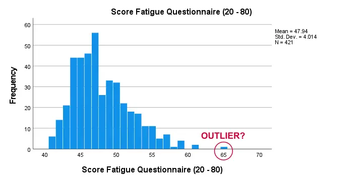
I think these values still look pretty plausible and I don't expect them to have a major impact on our analyses. Although disputable, I'll leave them in the data for now.
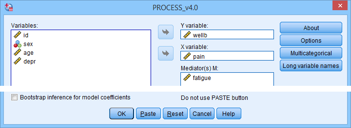
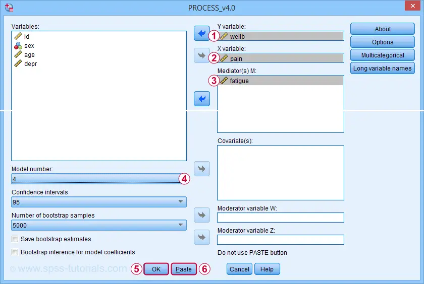
SPSS PROCESS Dialogs
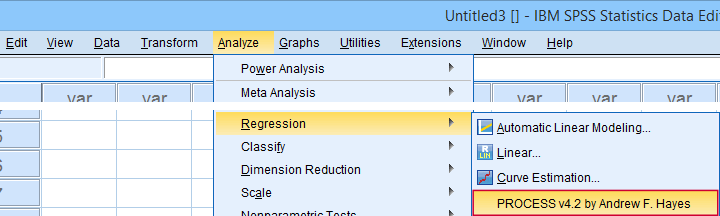
First off, make sure you have PROCESS installed as covered in SPSS PROCESS Macro Tutorial. After opening our data in SPSS, let's navigate to
![]()
![]() as shown below.
as shown below.
For a simple mediation analysis, we fill out the PROCESS dialogs as shown below.
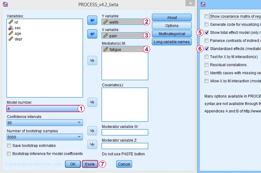
After completing these steps, you can either
- click “Ok” and just run the analysis;
- click “Paste” and run the (huge) syntax that's pasted or;
- click “Paste”, rearrange the syntax and then run it.
We discussed this last option in SPSS PROCESS Macro Tutorial. This may take you a couple of minutes but it'll pay off in the end. Our final syntax is shown below.
set mdisplay tables.
*READ PROCESS DEFINITION.
insert file = 'd:/downloaded/DEFINE-PROCESS-42.sps'.
*RUN PROCESS MODEL 4 (SIMPLE MEDIATION).
!PROCESS
y=wellb
/x=pain
/m=fatigue
/stand = 1 /* INCLUDE STANDARDIZED (BETA) COEFFICIENTS */
/total = 1 /* INCLUDE TOTAL EFFECT MODEL */
/decimals=F10.4
/boot=5000
/conf=95
/model=4
/seed = 20221227. /* MAKE BOOTSTRAPPING REPLICABLE */
SPSS PROCESS Output
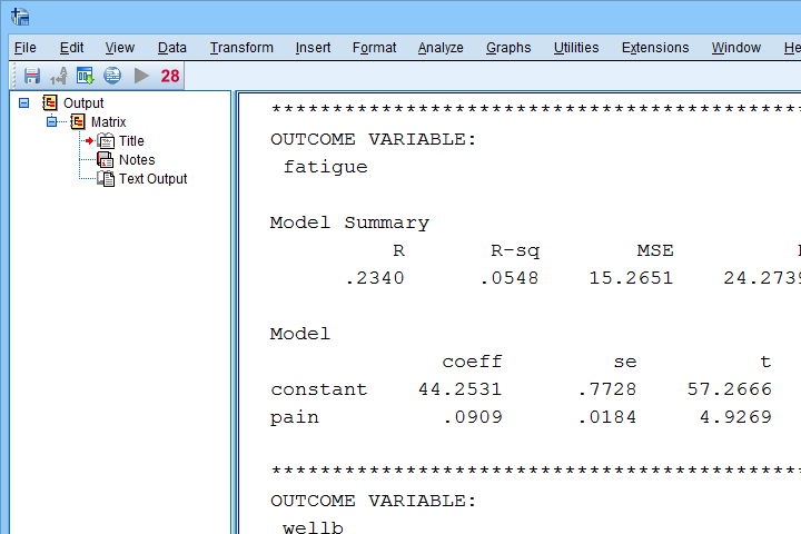
Let's first look at path \(a\): this is the effect from \(X\) (pain) onto \(M\) (fatigue). We find it in the output if we look for OUTCOME VARIABLE fatigue as shown below.
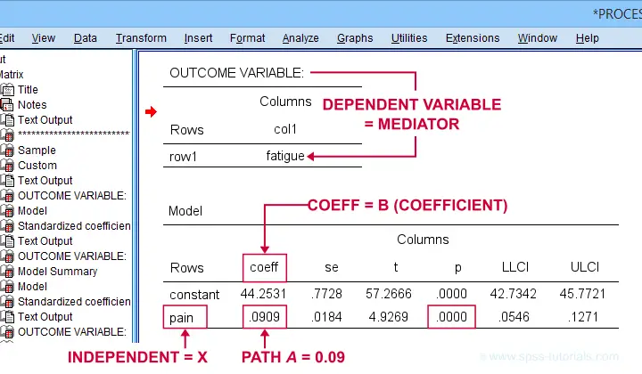
For path \(a\), b = 0.09, p < .001: on average, higher pain scores are associated with more fatigue and this is highly statistically significant. This outcome is as expected if our mediation model is correct.
SPSS PROCESS Output - Paths B and C’
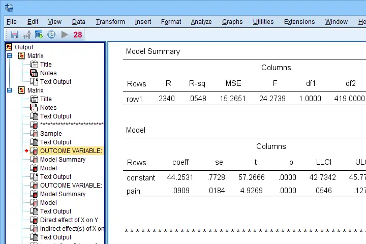
Paths \(b\) and \(c\,'\) are found in a single table. It's the one for which OUTCOME VARIABLE is \(Y\) (well-being) and includes b-coefficients for both \(X\) (pain) and \(M\) fatigue.
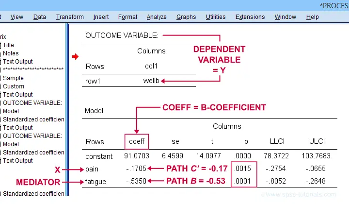
Note that path \(b\) is highly significant, as expected from our mediation hypotheses. Path \(c\,'\) (the direct effect) is also significant but our mediation model does not require this.
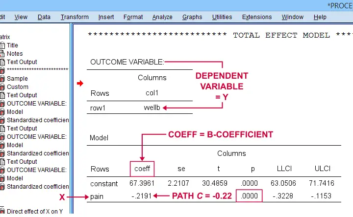
SPSS PROCESS Output - Path C
Some (but not all) authors also report the total effect, path \(c\). It is found in the table that has OUTCOME VARIABLE \(Y\) (well-being) that does not have a b-coefficient for the mediator.
Mediation Summary Diagram & Conclusion
The 4 main paths we examined thus far suffice for a classical mediation analysis. We summarized them in the figure below.
As hypothesized, paths \(a\) and \(b\) are both significant. Also note that direct effect is closer to zero than the total effect. This makes sense because the (negative) direct effect is the (negative) total effect minus the (negative) indirect effect.
A final point is that the direct effect is still significant: the indirect effect only partly accounts for the relation from pain onto well-being. This is known as partial mediation. A careful conclusion could thus be that
the effect from pain onto well-being
is partially mediated by fatigue.
Indirect Effect and Index of Mediation
Thus far, we established mediation by examining paths \(a\) and \(b\) separately. A more modern approach, however, focuses mostly on the entire indirect effect which is simply
$$\text{indirect effect } ab = a \cdot b$$
For our example, \(ab\) is the change in \(Y\) (well-being) associated with a 1-unit increase in \(X\) pain through \(M\) (fatigue). This indirect effect is shown in the table below.
Note that PROCESS does not compute any p-value or confidence interval (CI) for \(ab\). Instead, it estimates a CI by bootstrapping. This CI may be slightly different in your output because it's based on random sampling.
Importantly, the 95% CI [-0.08, -0.02] does not contain zero. This tells us that p < .05 even though we don't have an exact p-value. An alternative for bootstrapping that does come up with a p-value here is the Sobel test.
PROCESS also reports the standardized b-coefficient for \(ab\). This is usually denoted as β and is completely unrelated to (1 - β) or power in statistics. This number, 0.04, is known as the index of mediation and is often interpreted as an effect size measure.
A huge stupidity in this table is that b is denoted as “Effect” rather than “coeff” as in the other tables. For adding to the confusion, “Effect” refers to either b or β. Denoting b as b and β as β would have been highly preferable here.
APA Reporting Mediation Analysis
Mediation analysis is often reported as separate regression analyses: “the first step of our analysis showed that the effect of pain on fatigue was significant, b = 0.09, p < .001...” Some authors also include t-values and degrees of freedom (df) for b-coefficients. For some dumb reason, PROCESS does not report degrees of freedom but you can compute them as
$$df = N - k - 1$$
where
- \(N\) denotes the total sample size (N = 421 in our example) and
- \(k\) denotes the number of predictors in the model (1 or 2 in our example).
Like so, we could report “the second step of our analysis showed that the effect of fatigue on well-being was also significant, b = -0.53, t(419) = -3.89, p < .001...”
Final Notes
First off, mediation is inherently a causal model: \(X\) causes \(M\) which, in turn, causes \(Y\). Nevertheless, mediation analysis does not usually support any causal claims. A rare exception could be \(X\) being a (possibly dichotomous) manipulation variable. In most cases, however, we can merely conclude that
our data do (not) contradict
some (causal) mediation model.
This is not quite the strong conclusion we'd usually like to draw.
A second point is that I dislike the verbose text reporting suggested by the APA. As shown below, a simple table presents our results much more clearly and concisely.
Lastly, we feel that our example analysis would have been stronger if we had standardized all variables into z-scores prior to running PROCESS. The simple reason is that unstandardized values are uninterpretable for variables such as pain, fatigue and so on. What does a pain score of 60 mean? Low? Medium? High?
In contrast: a pain z-score of -1 means one standard deviation below the mean. If these scores are normally distributed, this is roughly the 16th percentile.
This point carries over to our regression coefficients:
b-coefficients are not interpretable because
we don't know how much a “unit” is
for our (in)dependent variables. Therefore, reporting only β coefficients makes much more sense.
Now, we do have these standardized coefficients in our output. However, most confidence intervals apply to the unstandardized coefficients. This can be fixed by standardizing all variables prior to running PROCESS.
Thanks for reading!
Confidence Intervals for Means in SPSS
- Assumptions for Confidence Intervals for Means
- Any Confidence Level - All Cases
- 95% Confidence Level - Separate Groups
- Any Confidence Level - Separate Groups
- Bonferroni Corrected Confidence Intervals
Confidence intervals for means are among the most essential statistics for reporting. Sadly, they're pretty well hidden in SPSS. This tutorial quickly walks you through the best (and worst) options for obtaining them. We'll use adolescents_clean.sav -partly shown below- for all examples.
Assumptions for Confidence Intervals for Means
Computing confidence intervals for means requires
- independent observations and
- normality: our variables must be normally distributed in the population represented by our sample.
1. A visual inspection of our data suggests that each case represents a distinct respondent so it seems safe to assume these are independent observations.
2. Second, the normality assumption is only required for small samples of N < 25 or so. For larger samples, the central limit theorem ensures that the sampling distributions for means, sums and proportions approximate normal distributions. In short,
our example data meet both assumptions.
Any Confidence Level - All Cases I
If we want to analyze all cases as a single group, our best option is the one sample t-test dialog.
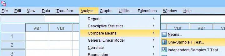
The final output will include confidence intervals for the differences between our test value and our sample means. Now, if we use 0 as the test value, these differences will be exactly equal to our sample means.
Clicking results in the syntax below. Let's run it.
T-TEST
/TESTVAL=0
/MISSING=ANALYSIS
/VARIABLES=iq depr anxi soci wellb
/CRITERIA=CI(.99).
Result
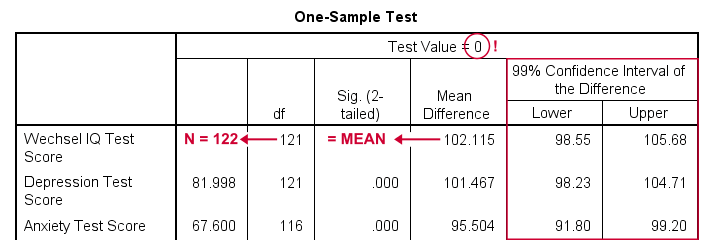
- as long as we use 0 as the test value, mean differences are equal to the actual means. This holds for their confidence intervals as well;
- the table indirectly includes the sample sizes: df = N - 1 and therefore N = df + 1.
Any Confidence Level - All Cases II
An alternative -but worse- option for obtaining these same confidence intervals is from
![]()
![]() We'll discuss these dialogs and their output in a minute under Any Confidence Level - Separate Groups II. They result in the syntax below.
We'll discuss these dialogs and their output in a minute under Any Confidence Level - Separate Groups II. They result in the syntax below.
EXAMINE VARIABLES=iq depr anxi soci wellb
/PLOT NONE
/STATISTICS DESCRIPTIVES
/CINTERVAL 95
/MISSING PAIRWISE /*IMPORTANT!*/
/NOTOTAL.
*Minimal syntax - returns 95% CI's by default.
examine iq depr anxi soci wellb
/missing pairwise /*IMPORTANT!*/.
95% Confidence Level - Separate Groups
In many situations, analysts report statistics for separate groups such as male and female respondents. If these statistics include 95% confidence intervals for means, the way to go is the One-Way ANOVA dialog.
Now, sex is a dichotomous variable so we compare these 2 means with a t-test rather than an ANOVA -even though the significance levels are identical for these tests. However, the dialogs below result in a much nicer -and technically correct- descriptives table than the t-test dialogs.
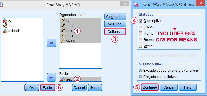
 Descriptives includes 95% CI's for means but other confidence levels aren't available.
 Clicking results in the syntax below. Let's run it.
ONEWAY iq depr anxi soci wellb BY sex
/STATISTICS DESCRIPTIVES .
Result
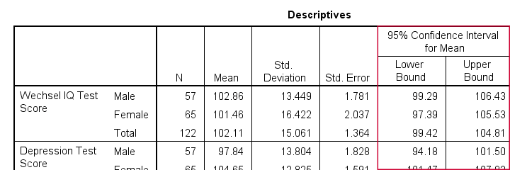
The resulting table has a nice layout that comes pretty close to the APA recommended format. It includes
- sample sizes;
- sample means;
- standard deviations and
- 95% CI's for means.
As mentioned, this method is restricted to 95% CI's. So let's look into 2 alternatives for other confidence levels.
Any Confidence Level - Separate Groups I
So how to obtain other confidence intervals for separate groups? The best option is adding a SPLIT FILE to the One Sample T-Test method. Since we discussed these dialogs and output under Any Confidence Level - All Cases I, we'll now just present the modified syntax.
sort cases by sex.
split file layered by sex.
*Obtain 95% CI's for means of iq to wellb.
T-TEST
/TESTVAL=0
/MISSING=ANALYSIS
/VARIABLES=iq depr anxi soci wellb
/CRITERIA=CI(.95).
*Switch off SPLIT FILE for succeeding output.
split file off.
Any Confidence Level - Separate Groups II
A last option we should mention is the Explore dialog as shown below.
We mostly discuss it for the sake of completeness because
SPSS’ Explore dialog is a real showcase of stupidity
and poor UX design.
Just a few of its shortcomings are that
- you can select “statistics” but not which statistics;
- if you do so, you always get a tsunami of statistics -the vast majority of which you don't want;
- what you probably do want are sample sizes but these are not available;
- the sample sizes that are actually used may be different than you think: in contrast to similar dialogs, Explore uses listwise exclusion of missing values by default;
- what you probably do want, is exclusion of missing values by analysis or variable. This is available but mislabeled “pairwise” exclusion.
- the Explore dialog generates an EXAMINE command so many users think these are 2 separate procedures.
For these reasons, I personally only use Explore for
These tests are under -the very last place you'd expect them.
But anyway, the steps shown below result in confidence intervals for means for males and females separately.
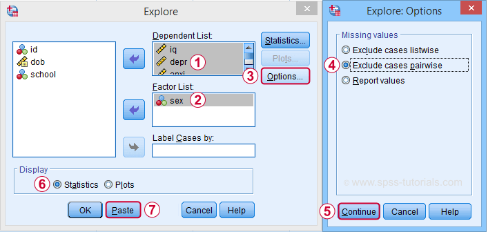
 Clicking generates the syntax below.
EXAMINE VARIABLES=iq depr anxi soci wellb BY sex
/PLOT NONE
/STATISTICS DESCRIPTIVES
/CINTERVAL 95
/MISSING PAIRWISE /*IMPORTANT!*/
/NOTOTAL.
*Minimal syntax - returns 95% CI's by default.
examine iq depr anxi soci wellb by sex
/missing pairwise /*IMPORTANT!*/
/nototal.
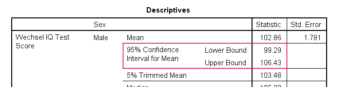
Result
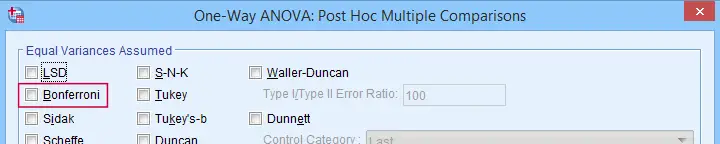
Bonferroni Corrected Confidence Intervals
All examples in this tutorial used 5 outcome variables measured on the same sample of respondents. Now, a 95% confidence interval has a 5% chance of not enclosing the population parameter we're after. So for 5 such intervals, there's a (1 - 0.955 =) 0.226 probability that at least one of them is wrong.
Some analysts argue that this problem should be fixed by applying a Bonferroni correction. Some procedures in SPSS have this as an option as shown below.
But what about basic confidence intervals? The easiest way is probably to adjust the confidence levels manually by
$$level_{adj} = 100\% - \frac{100\% - level_{unadj}}{N_i}$$
where \(N_i\) denotes the number of intervals calculated on the same sample. So some Bonferroni adjusted confidence levels are
- 95.00% if you calculate 1 (95%) confidence interval;
- 97.50% if you calculate 2 (95%) confidence intervals;
- 98.33% if you calculate 3 (95%) confidence intervals;
- 98.75% if you calculate 4 (95%) confidence intervals;
- 99.00% if you calculate 5 (95%) confidence intervals;
and so on.
Well, I think that should do. I can't think of anything else I could write on this topic. If you do, please throw us a comment below.
Thanks for reading!
SPSS PROCESS Macro Tutorial
- Downloading & Installing PROCESS
- Creating Tables instead of Text Output
- Using PROCESS with Syntax
- PROCESS Model Numbers
- PROCESS & Dummy Coding
- Strengths & Weaknesses of PROCESS
What is PROCESS?
PROCESS is a freely downloadable SPSS tool for estimating regression models with mediation and/or moderation effects. An example of such a model is shown below.
This model can fairly easily be estimated without PROCESS as discussed in SPSS Mediation Analysis Tutorial. However, using PROCESS has some advantages (as well as disadvantages) over a more classical approach. So how to get PROCESS and how does it work?
Those who want to follow along may download and open wellbeing.sav, partly shown below.
Note that this tutorial focuses on becoming proficient with PROCESS. The example analysis will be covered in a future tutorial.
Downloading & Installing PROCESS
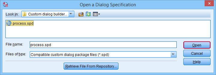
PROCESS can be downloaded here (scroll down to “PROCESS macro for SPSS, SAS, and R”). The download comes as a .zip file which you first need to unzip. After doing so, in SPSS, navigate to
![]()
![]() Select “process.spd” and click “Open” as shown below.
Select “process.spd” and click “Open” as shown below.
This should work for most SPSS users on recent versions. If it doesn't, consult the installation instructions that are included with the download.
Running PROCESS
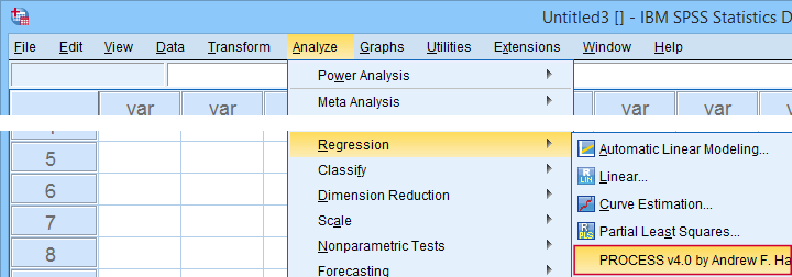
If you successfully installed PROCESS, you'll find it in the regression menu as shown below.
For a very basic mediation analysis, we fill out the dialog as shown below.
 Y refers to the dependent (or “outcome”) variable;
 X refers to the independent variable or “predictor” in a regression context;
 For simple mediation, select model 4. We'll have a closer look at model numbers in a minute;
 Just for now, let's click “Ok”.
Result
The first thing that may strike you, is that the PROCESS output comes as plain text. This is awkward because formatting it is very tedious and you can't adjust any decimal places. So let's fix that.
Creating Tables instead of Text Output
If you're using SPSS version 24 or higher, run the following SPSS syntax: set mdisplay tables. After doing so, running PROCESS will result in normal SPSS output tables rather than plain text as shown below.
Note that you can readily copy-paste these tables into Excel and/or adjust their decimal places.
Using PROCESS with Syntax
First off: whatever you do in SPSS, save your syntax. Now, like any other SPSS dialog, PROCESS has a Paste button for pasting its syntax. However, a huge stupidity from the programmers is that doing so results in some 6,140 (!) lines of syntax. I'll add the first lines below.
/* Written by Andrew F Hayes */.
/* www.afhayes.com */.
/* www.processmacro.org */.
/* Copyright 2017-2021 by Andrew F Hayes */.
/* Documented in http://www.guilford.com/p/hayes3 */.
/* THIS CODE SHOULD BE DISTRIBUTED ONLY THROUGH PROCESSMACRO.ORG */.
You can run and save this syntax but having over 6,140 lines is awkward. Now, this huge syntax basically consists of 2 parts:
- a macro definition of some 6,130 lines: this consists of the formulas and computations that are performed on the input (variables, models and so on) that the SPSS user specifies;
- a macro call of some 10 lines: this tells SPSS to run the macro and which input to use.
The macro call is at the very end of the pasted syntax (use the Ctrl + End shortcut in your syntax window) and looks as follows.
y=wellb
/x=pain
/m=fatigue
/decimals=F10.4
/boot=5000
/conf=95
/model=4.
After you run the (huge) macro definition just once during your session, you only need one (short) macro call for every PROCESS model you'd like to run.
A nice way to implement this, is to move the entire macro definition into a separate SPSS syntax file. Those who want to try this can download DEFINE-PROCESS-40.sps.
Although technically not mandatory, macro names should really start with exclamation marks. Therefore, we replaced DEFINE PROCESS with DEFINE !PROCESS in line 2,983 of this file. The final trick is that we can run this huge syntax file without opening it by using the INSERT command. Like so, the syntax below replicates our entire first PROCESS analysis.
insert file = 'd:/downloaded/DEFINE-PROCESS-40.sps'.
*RERUN FIRST PROCESS ANALYSIS.
!PROCESS
y=wellb
/x=pain
/m=fatigue
/decimals=F10.4
/boot=5000
/conf=95
/model=4.
Note: for replicating this, you may need to replace d:/downloaded by the folder where DEFINE-PROCESS-40.sps is located on your computer.
PROCESS Model Numbers
As we speak, PROCESS implements 94 models. An overview of the most common ones is shown in this Googlesheet (read-only), partly shown below.
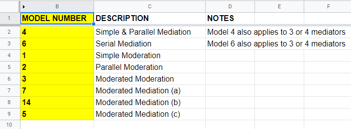
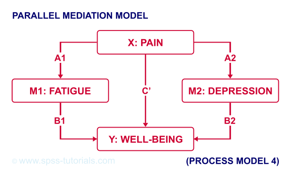
For example, if we have an X, Y and 2 mediator variables, we may hypothesize parallel mediation as illustrated below.
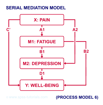
However, you could also hypothesize that mediator 1 affects mediator 2 which, in turn, affects Y. If you want to test this serial mediation effect, select model 6 in PROCESS.
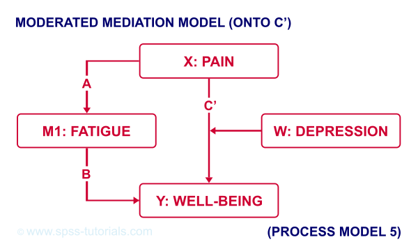
For moderated mediation, things get more complicated: the moderator could act upon any combination of paths a, b or c’. If you believe the moderator only affects path c’, choose model 5 as shown below.
An overview of all model numbers is given in this book.
PROCESS & Dummy Coding
A quick overview of variable types for PROCESS is shown in this Googlesheet (read-only), partly shown below.
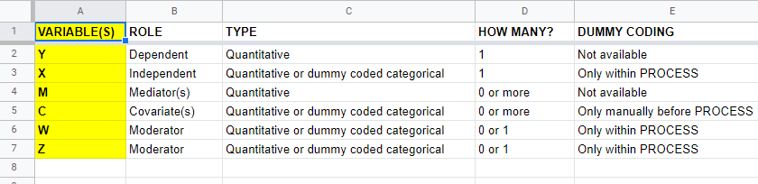
Keep in mind that PROCESS is entirely based on linear regression. This requires that dependent variables are quantitative (interval or ratio measurement level). This includes mediators, which act as both dependent and independent variables.
All other variables
- may be quantitative;
- may be dichotomous (preferably coded as 0-1);
- or must be dummy coded (nominal and ordinal variables).
X and moderator variables W and Z can only be dummy coded within PROCESS as shown below.
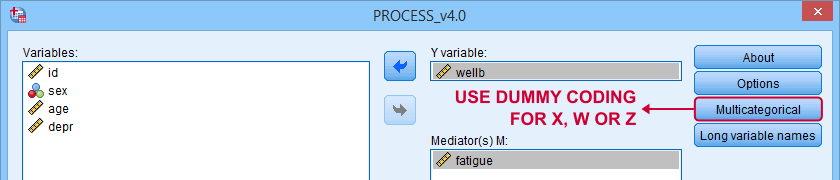
Covariates must be dummy coded before using PROCESS. For a handy tool, see SPSS Create Dummy Variables Tool.
Making Bootstrapping Replicable
Some PROCESS models rely on bootstrapping for reporting confidence intervals. Very basically, bootstrapping comes down to
- drawing a simple random sample (with replacement) from the data;
- computing statistics (for PROCESS, these are b-coefficients) on this new sample;
- repeating this procedure many (typically 1,000 - 10,000) times;
- examining to what extent each statistic fluctuates over these bootstrap samples.
Like so, a 95% bootstrapped CI for some parameter consists of the [2.5th - 97.5th] percentiles for some statistic over the bootstrap samples.
Now, due to the random nature of bootstrapping, running a PROCESS model twice typically results in slightly different CI's. This is undesirable but a fix is to add a /SEED subcommand to the macro call as shown below.
y=wellb
/x=pain
/m=fatigue
/decimals=F10.4
/boot=5000
/conf=95
/model=4
/seed = 20221227. /*MAKE BOOTSTRAPPED CI'S REPLICABLE*/
The random seed can be any positive integer. Personally, I tend to use the current date in YYYYMMDD format (20221227 is 27 December, 2022). An alternative is to run something like SET SEED 20221227. before running PROCESS. In this case, you need to prevent PROCESS from overruling this random seed, which you can do by replacing set seed = !seed. by *set seed = !seed. in line 3,022 of the macro definition.
Strengths & Weaknesses of PROCESS
A first strength of PROCESS is that it can save a lot of time and effort. This holds especially true for more complex models such as serial and moderated mediation.
Second, the bootstrapping procedure implemented in PROCESS is thought to have higher power and more accuracy than alternatives such as the Sobel test.
A weakness, though, is that PROCESS does not generate regression residuals. These are often used to examine model assumptions such as linearity and homoscedasticity as discussed in Linear Regression in SPSS - A Simple Example.
Another weakness of PROCESS is that some very basic models are not possible at all in PROCESS. A simple example is parallel moderation as illustrated below.
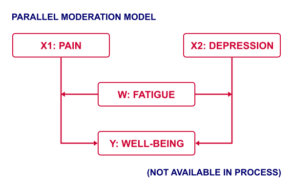
This can't be done because PROCESS is limited to a single X variable. Using just SPSS, estimating this model is a piece of cake. It's a tiny extension of the model discussed in SPSS Moderation Regression Tutorial.
A technical weakness is that PROCESS generates over 6,000 lines of syntax when pasted. The reason this happens is that PROCESS is built on 2 long deprecated SPSS techniques:
- the front end is an SPSS custom dialog (.spd) file. These have long been replaced by SPSS extension bundles (.spe files);
- the actual syntax is wrapped into a macro. SPSS macros have been deprecated in favor of Python ages ago.
I hope this will soon be fixed. There's really no need to bother SPSS users with 6,000 lines of source code.
Thanks for reading!
SPSS – Kendall’s Concordance Coefficient W
Kendall’s Concordance Coefficient W is a number between 0 and 1
that indicates interrater agreement.
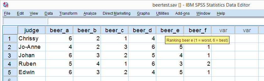
So let's say we had 5 people rank 6 different beers as shown below. We obviously want to know which beer is best, right? But could we also quantify how much these raters agree with each other? Kendall’s W does just that.
Kendall’s W - Example
So let's take a really good look at our beer test results. The data -shown above- are in beertest.sav. For answering which beer was rated best, a Friedman test would be appropriate because our rankings are ordinal variables. A second question, however, is to what extent do all 5 judges agree on their beer rankings? If our judges don't agree at all which beers were best, then we can't possibly take their conclusions very seriously. Now, we could say that “our judges agreed to a large extent” but we'd like to be more precise and express the level of agreement in a single number. This number is known as Kendall’s Coefficient of Concordance W.2,3
Kendall’s W - Basic Idea
Let's consider the 2 hypothetical situations depicted below: perfect agreement and perfect disagreement among our raters. I invite you to stare at it and think for a minute.
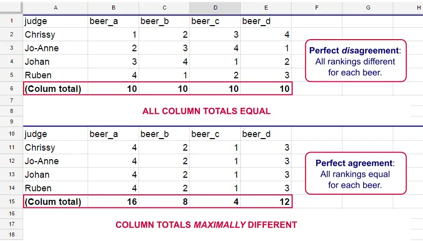
As we see, the extent to which raters agree is indicated by the extent to which the column totals differ. We can express the extent to which numbers differ as a number: the variance or standard deviation.
Kendall’s W is defined as
$$W = \frac{Variance\,over\,column\,totals}{Maximum\,possible\,variance\,over\,column\,totals}$$
As a result, Kendall’s W is always between 0 and 1. For instance, our perfect disagreement example has W = 0; because all column totals are equal, their variance is zero.
Our perfect agreement example has W = 1 because the variance among column totals is equal to the maximal possible variance. No matter how you rearrange the rankings, you can't possibly increase this variance any further. Don't believe me? Give it a go then.
So what about our actual beer data? We'll quickly find out with SPSS.
Kendall’s W in SPSS
We'll get Kendall’s W from SPSS’ menu. The screenshots below walk you through.
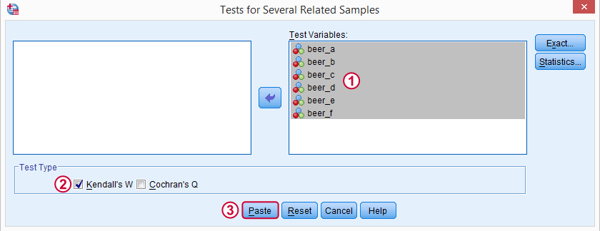
Note: SPSS thinks our rankings are nominal variables. This is because they contain few distinct values. Fortunately, this won't interfere with the current analysis. Completing these steps results in the syntax below.
Kendall’s W - Basic Syntax
NPAR TESTS
/KENDALL=beer_a beer_b beer_c beer_d beer_e beer_f
/MISSING LISTWISE.
Kendall’s W - Output
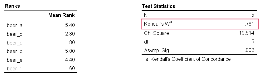
And there we have it: Kendall’s W = 0.78. Our beer judges agree with each other to a reasonable but not super high extent. Note that we also get a table with the (column) mean ranks that tells us which beer was rated most favorably.
Average Spearman Correlation over Judges
Another measure of concordance is the average over all possible Spearman correlations among all judges.1 It can be calculated from Kendall’s W with the following formula
$$\overline{R}_s = {kW - 1 \over k - 1}$$
where \(\overline{R}_s\) denotes the average Spearman correlation and \(k\) the number of judges.
For our example, this comes down to
$$\overline{R}_s = {5(0.781) - 1 \over 5 - 1} = 0.726$$
We'll verify this by running and averaging all possible Spearman correlations in SPSS. We'll leave that for a next tutorial, however, as doing so properly requires some highly unusual -but interesting- syntax.
Thank you for reading!
References
- Howell, D.C. (2002). Statistical Methods for Psychology (5th ed.). Pacific Grove CA: Duxbury.
- Slotboom, A. (1987). Statistiek in woorden [Statistics in words]. Groningen: Wolters-Noordhoff.
- Van den Brink, W.P. & Koele, P. (2002). Statistiek, deel 3 [Statistics, part 3]. Amsterdam: Boom.
SPSS ANCOVA – Beginners Tutorial
- ANCOVA - Null Hypothesis
- ANCOVA Assumptions
- SPSS ANCOVA Dialogs
- SPSS ANCOVA Output - Between-Subjects Effects
- SPSS ANCOVA Output - Adjusted Means
- ANCOVA - APA Style Reporting
A pharmaceutical company develops a new medicine against high blood pressure. They tested their medicine against an old medicine, a placebo and a control group. The data -partly shown below- are in blood-pressure.sav.
Our company wants to know if their medicine outperforms the other treatments: do these participants have lower blood pressures than the others after taking the new medicine? Since treatment is a nominal variable, this could be answered with a simple ANOVA.
Now, posttreatment blood pressure is known to correlate strongly with pretreatment blood pressure. This variable should therefore be taken into account as well. The relation between pretreatment and posttreatment blood pressure could be examined with simple linear regression because both variables are quantitative.
We'd now like to examine the effect of medicine while controlling for pretreatment blood pressure. We can do so by adding our pretest as a covariate to our ANOVA. This now becomes ANCOVA -short for analysis of covariance. This analysis basically combines ANOVA with regression.
Surprisingly, analysis of covariance does not actually involve covariances as discussed in Covariance - Quick Introduction.
ANCOVA - Null Hypothesis
Generally, ANCOVA tries to demonstrate some effect by rejecting the null hypothesis that all population means are equal when controlling for 1+ covariates. For our example, this translates to “average posttreatment blood pressures are equal for all treaments when controlling for pretreatment blood pressure”. The basic analysis is pretty straightforward but it does require quite a few assumptions. Let's look into those first.
ANCOVA Assumptions
- independent observations;
- normality: the dependent variable must be normally distributed within each subpopulation. This is only needed for small samples of n < 20 or so;
- homogeneity: the variance of the dependent variable must be equal over all subpopulations. This is only needed for sharply unequal sample sizes;
- homogeneity of regression slopes: the b-coefficient(s) for the covariate(s) must be equal among all subpopulations.
- linearity: the relation between the covariate(s) and the dependent variable must be linear.
Taking these into account, a good strategy for our entire analysis is to
- first run some basic data checks: histograms and descriptive statistics give quick insights into frequency distributions and sample sizes. This tells us if we even need assumptions 2 and 3 in the first place.
- see if assumptions 4 and 5 hold by running regression analyses for our treatment groups separately;
- run the actual ANCOVA and see if assumption 3 -if necessary- holds.
Data Checks I - Histograms
Let's first see if our blood pressure variables are even plausible in the first place. We'll inspect their histograms by running the syntax below. If you prefer to use SPSS’ menu, consult Creating Histograms in SPSS.
frequencies predias postdias
/format notable
/histogram.
Result
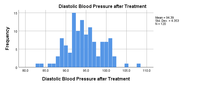
Conclusion: the frequency distributions for our blood pressure measurements look plausible: we don't see any very low or high values. Neither shows a lot of skewness or kurtosis and they both look reasonably normally distributed.
Data Checks II - Descriptive Statistics
Next, let's look into some descriptive statistics, especially sample sizes. We'll create and inspect a table with the
- sample sizes,
- means and
- standard deviations
of the outcome variable and the covariate for our treatment groups separately. We could do so from
![]()
![]() or -faster- straight from syntax.
or -faster- straight from syntax.
means predias postdias by treatment
/statistics anova.
Result
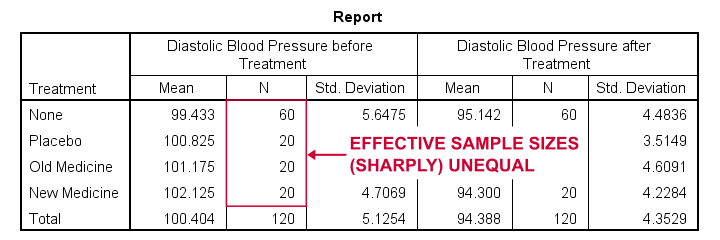
The main conclusions from our output are that
- all treatment groups have reasonable samples sizes of at least n = 20. This means we don't need to bother about the normality assumption. Otherwise, we could use a Shapiro-Wilk normality test or a Kolmogorov-Smirnov test but we rather avoid these.
- the treament groups have sharply unequal sample sizes. This implies that our ANCOVA will need to satisfy the homogeneity of variance assumption.
- the ANOVA results (not shown here) tell us that the posttreatment means don't differ statistically significantly, F(3,116) = 1.619, p = 0.189. However, this test did not yet include our covariate -pretreatment blood pressure.
So much for our basic data checks. We'll now look into the regression results and then move on to the actual ANCOVA.
Separate Regression Lines for Treatment Groups
Let's now see if our regression slopes are equal among groups -one of the ANCOVA assumptions. We'll first just visualize them in a scatterplot as shown below.
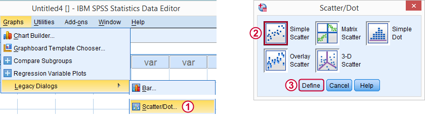
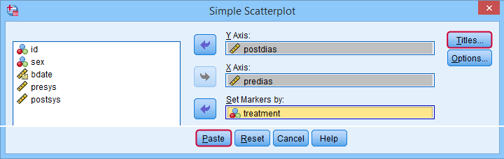
Clicking results in the syntax below.
GRAPH
/SCATTERPLOT(BIVAR)=predias WITH postdias BY treatment
/MISSING=LISTWISE.GRAPH
/TITLE='Diastolic Blood Pressure by Treatment'.
*Double-click resulting chart and click "Add fit line at subgroups" icon.
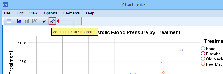
SPSS now creates a scatterplot with different colors for different treatment groups. Double-clicking it opens it in a Chart Editor window. Here we click the “Add Fit Lines at Subgroups” icon as shown below.
Result
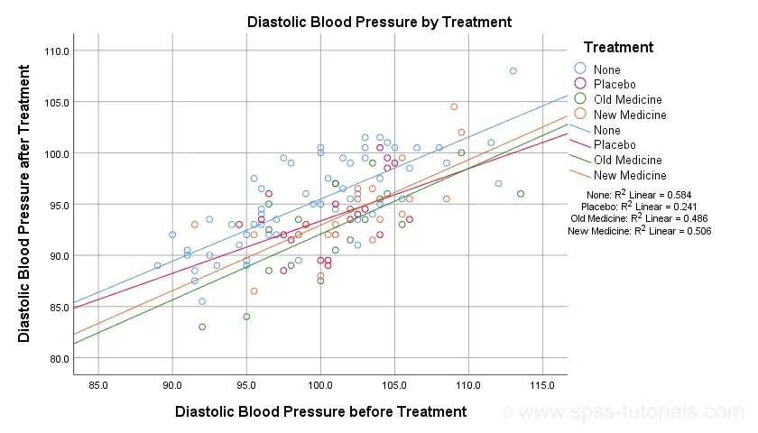
The main conclusion from this chart is that the regression lines are almost perfectly parallel: our data seem to meet the homogeneity of regression slopes assumption required by ANCOVA.
Furthermore, we don't see any deviations from linearity: this ANCOVA assumption also seems to be met. For a more thorough linearity check, we could run the actual regressions with residual plots. We did just that in SPSS Moderation Regression Tutorial.
Now that we checked some assumptions, we'll run the actual ANCOVA twice:
- the first run only examines the homogeneity of regression slopes assumption. If this holds, then there should not be any covariate by treatment interaction-effect.
- the second run tests our null hypothesis: are all population means equal when controlling for our covariate?
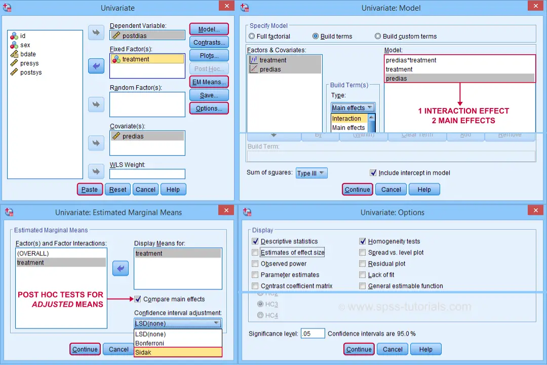
SPSS ANCOVA Dialogs
Let's first navigate to
![]()
![]() and fill out the dialog boxes as shown below.
and fill out the dialog boxes as shown below.
Clicking generates the syntax shown below.
UNIANOVA postdias BY treatment WITH predias
/METHOD=SSTYPE(3)
/INTERCEPT=INCLUDE
/EMMEANS=TABLES(treatment) WITH(predias=MEAN) COMPARE ADJ(SIDAK)
/PRINT ETASQ HOMOGENEITY
/CRITERIA=ALPHA(.05)
/DESIGN=predias treatment predias*treatment. /* predias*treatment adds interaction effect to model.
Result
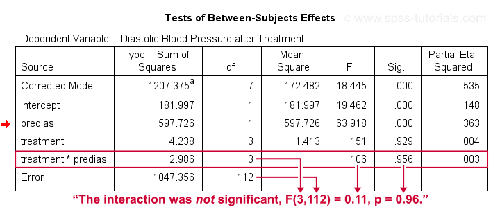
First note that our covariate by treatment interaction is not statistically significant at all: F(3,112) = 0.11, p = 0.96. This means that the regression slopes for the covariate don't differ between treatments: the homogeneity of regression slopes assumption seems to hold almost perfectly.
For these data, this doesn't come as a surprise: we already saw that the regression lines for different treatment groups were roughly parallel. Our first ANCOVA is basically a more formal way to make the same point.
SPSS ANCOVA II - Main Effects
We now run simply rerun our ANCOVA as previously. This time, however, we'll remove the covariate by treatment interaction effect. Doing so results in the syntax shown below.
UNIANOVA postdias BY treatment WITH predias
/METHOD=SSTYPE(3)
/INTERCEPT=INCLUDE
/EMMEANS=TABLES(treatment) WITH(predias=MEAN) COMPARE ADJ(SIDAK)
/PRINT ETASQ HOMOGENEITY
/CRITERIA=ALPHA(.05)
/DESIGN=predias treatment. /* only test for 2 main effects.
SPSS ANCOVA Output I - Levene's Test
Since our treatment groups have sharply unequal sample sizes, our data need to satisfy the homogeneity of variance assumption. This is why we included Levene's test in our analysis. Its results are shown below.
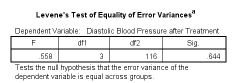
Conclusion: we don't reject the null hypothesis of equal error variances, F(3,116) = 0.56, p = 0.64. Our data meets the homogeneity of variances assumption. This means we can confidently report the other results.
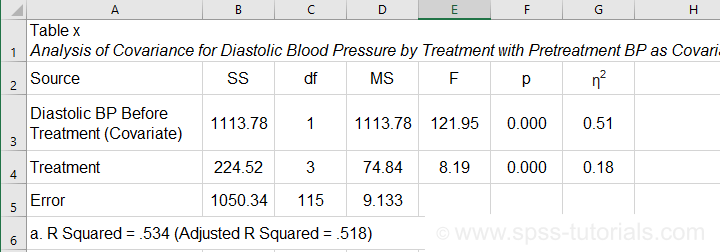
SPSS ANCOVA Output - Between-Subjects Effects
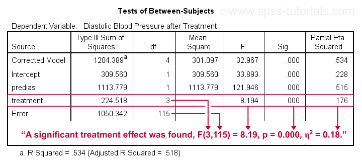
Conclusion: we reject the null hypothesis that our treatments result in equal mean blood pressures, F(3,115) = 8.19, p = 0.000.
Importantly, the effect size for treatment is between medium and large: partial eta squared (written as η2) = 0.176.
Apparently, some treatments perform better than others after all. Interestingly, this treatment effect was not statistically significant before including our pretest as a covariate.
So which treatments perform better or worse? For answering this, we first inspect our estimated marginal means table.
SPSS ANCOVA Output - Adjusted Means
One role of covariates is to adjust posttest means for any differences among the corresponding pretest means. These adjusted means and their standard errors are found in the Estimated Marginal Means table shown below.
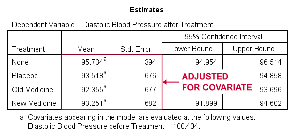
These adjusted means suggest that all treatments result in lower mean blood pressures than “None”. The lowest mean blood pressure is observed for the old medicine. So precisely which mean differences are statistically significant? This is answered by post hoc tests which are found in the Pairwise Comparisons table (not shown here). This table shows that all 3 treatments differ from the control group but none of the other differences are statistically significant. For a more detailed discussion of post hoc tests, see SPSS - One Way ANOVA with Post Hoc Tests Example.
ANCOVA - APA Style Reporting
For reporting our ANCOVA, we'll first present descriptive statistics for
- our covariate;
- our dependent variable (unadjusted);
- our dependent variable (adjusted for the covariate).
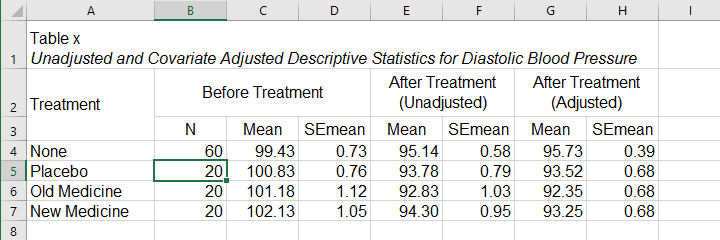
What's interesting about this table is that the posttest means are hardly adjusted by including our covariate. However, the covariate greatly reduces the standard errors for these means. This is why the mean differences are statistically significant only when the covariate is included. The adjusted descriptives are obtained from the final ANCOVA results. The unadjusted descriptives can be created from the syntax below.
means predias postdias by treatment
/cells count mean semean.
The exact APA table is best created by copy-pasting these statistics into Excel or Googlesheets.
Second, we'll present a standard ANOVA table for the effects included in our final model and error.
This table is constructed by copy-pasting the SPSS output table into Excel and removing the redundant rows.
Final Notes
So that'll do for a very solid but simple ANCOVA in SPSS. We could have written way more about this example analysis as there's much -much- more to say about the output. We'd also like to cover the basic ideas behind ANCOVA into more detail but that really requires a separate tutorial which we hope to write in some weeks from now.
Hope my tutorial has been helpful anyway. So last off:
thanks for reading!
SPSS Moderation Regression Tutorial
- SPSS Moderation Regression - Example Data
- SPSS Moderation Regression - Dialogs
- SPSS Moderation Regression - Coefficients Output
- Simple Slopes Analysis I - Fit Lines
- Simple Slopes Analysis II - Coefficients
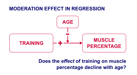
A sports doctor routinely measures the muscle percentages of his clients. He also asks them how many hours per week they typically spend on training. Our doctor suspects that clients who train more are also more muscled. Furthermore, he thinks that the effect of training on muscularity declines with age. In multiple regression analysis, this is known as a moderation interaction effect. The figure below illustrates it.
So how to test for such a moderation effect? Well, we usually do so in 3 steps:
- if both predictors are quantitative, we usually mean center them first;
- we then multiply the centered predictors into an interaction predictor variable;
- finally, we enter both mean centered predictors and the interaction predictor into a regression analysis.
SPSS Moderation Regression - Example Data
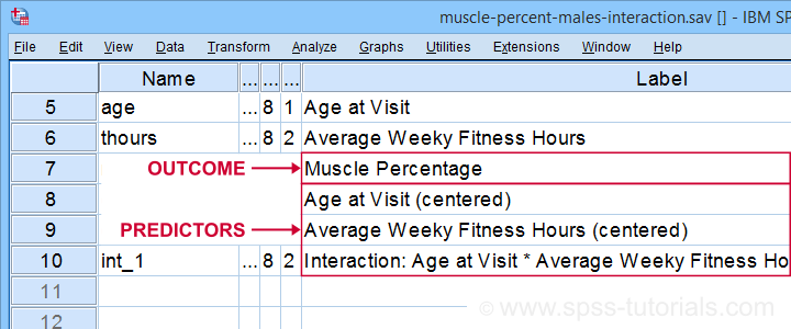
These 3 predictors are all present in muscle-percent-males-interaction.sav, part of which is shown below.
We did the mean centering with a simple tool which is downloadable from SPSS Mean Centering and Interaction Tool.
Alternatively, mean centering manually is not too hard either and covered in How to Mean Center Predictors in SPSS?
SPSS Moderation Regression - Dialogs
Our moderation regression is not different from any other multiple linear regression analysis: we navigate to
![]()
![]() and fill out the dialogs as shown below.
and fill out the dialogs as shown below.
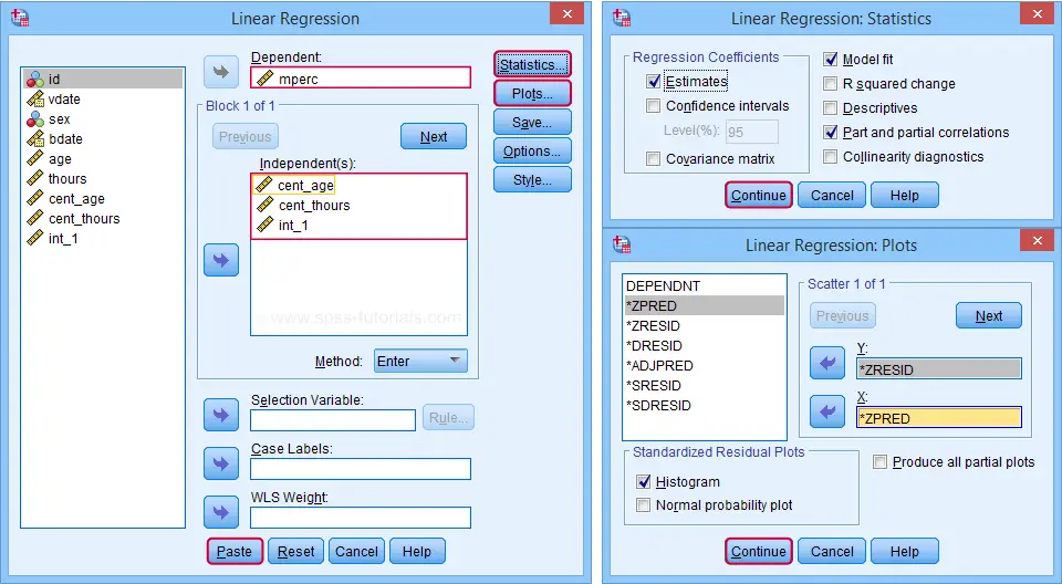
Clicking results in the following syntax. Let's run it.
REGRESSION
/MISSING LISTWISE
/STATISTICS COEFF OUTS R ANOVA ZPP
/CRITERIA=PIN(.05) POUT(.10)
/NOORIGIN
/DEPENDENT mperc
/METHOD=ENTER cent_age cent_thours int_1
/SCATTERPLOT=(*ZRESID ,*ZPRED)
/RESIDUALS HISTOGRAM(ZRESID).
SPSS Moderation Regression - Coefficients Output
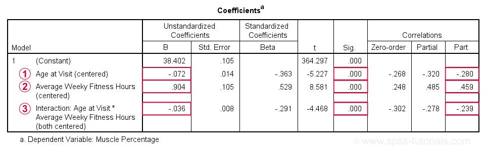
 Age is negatively related to muscle percentage. On average, clients lose 0.072 percentage points per year.
 Training hours are positively related to muscle percentage: clients tend to gain 0.9 percentage points for each hour they work out per week.
 The negative B-coefficient for the interaction predictor indicates that the training effect becomes more negative -or less positive- with increasing ages.
Now, for any effect to bear any importance, it must be statistically significant and have a reasonable effect size.
At p = 0.000, all 3 effects are highly statistically significant. As effect size measures we could use the semipartial correlations (denoted as “Part”) where
- r = 0.10 indicates a small effect;
- r = 0.30 indicates a medium effect;
- r = 0.50 indicates a large effect.
The training effect is almost large and the age and age by training interaction are almost medium. Regardless of statistical significance, I think the interaction may be ignored if its part correlation r < 0.10 or so but that's clearly not the case here. We'll therefore examine the interaction in-depth by means of a simple slopes analysis.
With regard to the residual plots (not shown here), note that
- the residual histogram doesn't look entirely normally distributed but -rather- bimodal. This somewhat depends on its bin width and doesn't look too alarming;
- the residual scatterplot doesn't show any signs of heteroscedasticity or curvilinearity. Altogether, these plots don't show clear violations of the regression assumptions.
Creating Age Groups
Our simple slopes analysis starts with creating age groups. I'll go for tertile groups: the youngest, intermediate and oldest 33.3% of the clients will make up my groups. This is an arbitrary choice: we may just as well create 2, 3, 4 or whatever number of groups. Equal group sizes are not mandatory either and perhaps even somewhat unusual. In any case, the syntax below creates the age tertile groups as a new variable in our data.
rank age
/ntiles(3) into agecat3.
*Label new variable and values.
variable labels agecat3 'Age Tertile Group'.
value labels agecat3 1 'Youngest Ages' 2 'Intermediary Ages' 3 'Highest Ages'.
*Check descriptive statistics age per age group.
means age by agecat3
/cells count min max mean stddev.
Result
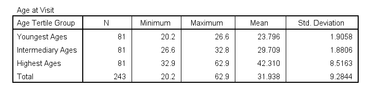
Some basic conclusions from this table are that
- our age groups have precisely equal sample sizes of n = 81;
- the group mean ages are unevenly distributed: the difference between young and intermediary -some 6 years- is much smaller than between intermediary and highest -some 13 years;
- the highest age group has a much larger standard deviation than the other 2 groups.
Points 2 and 3 are caused by the skewness in age and argue against using tertile groups. However, I think that having equal group sizes easily outweighs both disadvantages.
Simple Slopes Analysis I - Fit Lines
Let's now visualize the moderation interaction between age and training. We'll start off creating a scatterplot as shown below.
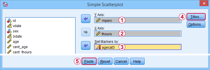
Clicking results in the syntax below.
GRAPH
/SCATTERPLOT(BIVAR)=thours WITH mperc BY agecat3
/MISSING=LISTWISE
/TITLE='Muscle Percentage by Training Hours by Age Group'.
*After running chart, add separate fit lines manually.
Adding Separate Fit Lines to Scatterplot
After creating our scatterplot, we'll edit it by double-clicking it. In the Chart Editor window that opens, we click the icon labeled Add Fit Line at Subgroups
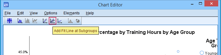
After adding the fit lines, we'll simply close the chart editor. Minor note: scatterplots with (separate) fit lines can be created in one go from the Chart Builder in SPSS version 25+ but we'll cover that some other time.
Result
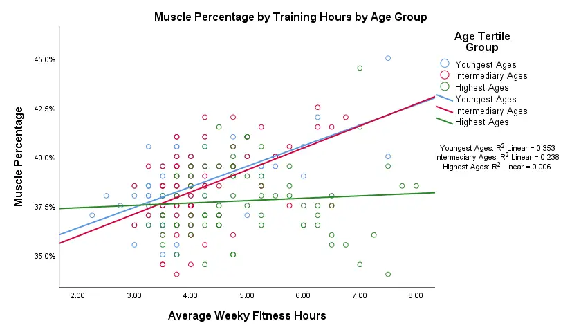
Our fit lines nicely explain the nature of our age by training interaction effect:
- the 2 youngest age groups show a steady increase in muscle percentage by training hours;
- for the oldest clients, however, training seems to hardly affect muscle percentage. This is how the effect of training on muscle percentage is moderated by age;
- on average, the 3 lines increase. This is the main effect of training;
- overall, the fit line for the oldest group is lower than for the other 2 groups. This is our main effect of age.
Again, the similarity between the 2 youngest groups may be due to the skewness in ages: the mean ages for these groups aren't too different but very different from the highest age group.
Simple Slopes Analysis II - Coefficients
After visualizing our interaction effect, let's now test it: we'll run a simple linear regression of training on muscle percentage for our 3 age groups separately. A nice way for doing so in SPSS is by using SPLIT FILE.
The REGRESSION syntax was created from the menu as previously but with (uncentered) training as the only predictor.
sort cases by agecat3.
split file layered by agecat3.
*Run simple linear regression with uncentered training hours on muscle percentage.
REGRESSION
/MISSING LISTWISE
/STATISTICS COEFF OUTS R ANOVA ZPP
/CRITERIA=PIN(.05) POUT(.10)
/NOORIGIN
/DEPENDENT mperc
/METHOD=ENTER thours
/SCATTERPLOT=(*ZRESID ,*ZPRED)
/RESIDUALS HISTOGRAM(ZRESID).
*Split file off.
split file off.
Result
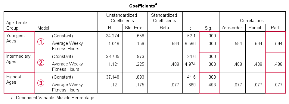
The coefficients table confirms our previous results:
for the youngest age group, the training effect is statistically significant at p = 0.000. Moreover, its part correlation of r = 0.59 indicates a large effect;
the results for the intermediary age group are roughly similar to the youngest group;
for the highest age group, the part correlation of r = 0.077 is not substantial. We wouldn't take it seriously even if it had been statistically significant -which it isn't at p = 0.49.
Last, the residual histograms (not shown here) don't show anything unusual. The residual scatterplot for the oldest age group looks curvilinear except from some outliers. We should perhaps take a closer look at this analysis but we'll leave that for another day.
Thanks for reading!
SPSS Chi-Square Test with Pairwise Z-Tests
Most data analysts are familiar with post hoc tests for ANOVA. Oddly, post hoc tests for the chi-square independence test are not widely used. This tutorial walks you through 2 options for obtaining and interpreting them in SPSS.
- Option 1 - CROSSTABS
- CROSSTABS with Pairwise Z-Tests Output
- Option 2 - Custom Tables
- Custom Tables with Pairwise Z-Tests Output
- Can these Z-Tests be Replicated?
Example Data
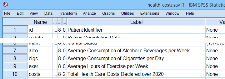
A sample of N = 300 respondents were asked about their education level and marital status. The data thus obtained are in edu-marit.sav. All examples in this tutorial use this data file.
Chi-Square Independence Test
Right. So let's see if education level and marital status are associated in the first place: we'll run a chi-square independence test with the syntax below. This also creates a contingency table showing both frequencies and column percentages.
crosstabs marit by educ
/cells count column
/statistics chisq.
Let's first take a look at the actual test results shown below.
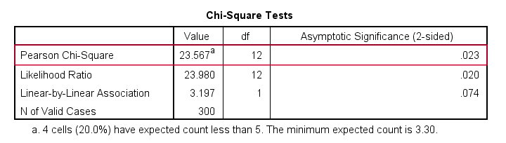
First off, we reject the null hypothesis of independence: education level and marital status are associated, χ2(12) = 23.57, p = 0.023. Note that that SPSS wrongfully reports this 1-tailed significance as a 2-tailed significance. But anyway, what we really want to know is precisely which percentages differ significantly from each other?
Option 1 - CROSSTABS
We'll answer this question by slightly modifying our syntax: adding BPROP (short for “Bonferroni proportions”) to the /CELLS subcommand does the trick.
crosstabs marit by educ
/cells count column bprop. /*bprop = Bonferroni adjusted z-tests for column proportions.
Running this simple syntax results in the table shown below.
CROSSTABS with Pairwise Z-Tests Output
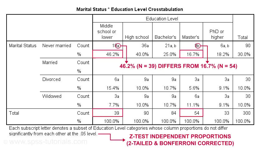
First off, take a close look at the table footnote: “Each subscript letter denotes a subset of Education Level categories whose column proportions do not differ significantly from each other at the .05 level.”
These conclusions are based on z-tests for independent proportions. These also apply to the percentages shown in the table: within each row, each possible pair of percentages is compared using a z-test. If they don't differ, they get a similar subscript. Reversely,
within each row, percentages that don't share a subscript
are significantly different.
For example, the percentage of people with middle school who never married is 46.2% and its frequency of n = 18 is labeled “a”. For those with a Master’s degree, 16.7% never married and its frequency of 9 is not labeled “a”. This means that 46.2% differs significantly from 16.7%.
The frequency of people with a Bachelor’s degree who never married (n = 21 or 25.0%) is labeled both “a” and “b”. It doesn't differ significantly from any cells labeled “a”, “b” or both. Which are all cells in this table row.
Now, a Bonferroni correction is applied for the number of tests within each row. This means that for \(k\) columns,
$$P_{bonf} = P\cdot\frac{k(k - 1)}{2}$$
where
- \(P_{bonf}\) denotes a Bonferroni corrected p-value and
- \(P\) denotes a “normal” (uncorrected) p-value.
Right, now our table has 5 education levels as columns so
$$P_{bonf} = P\cdot\frac{5(5 - 1)}{2} = P \cdot 10$$
which means that each p-value is multiplied by 10 and only then compared to alpha = 0.05. Or -reversely- only z-tests yielding an uncorrected p < 0.005 are labeled “significant”. This holds for all tests reported in this table. I'll verify these claims later on.
Option 2 - Custom Tables
A second option for obtaining “post hoc tests” for chi-square tests are Custom Tables. They're found under
![]()
![]() but only if you have a Custom Tables license. The figure below suggests some basic steps.
but only if you have a Custom Tables license. The figure below suggests some basic steps.
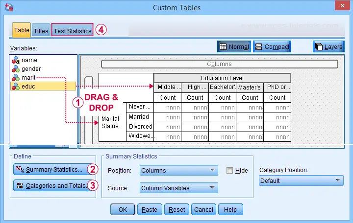
 You probably want to select both frequencies and column percentages for education level.
 We recommend you add totals for education levels as well.
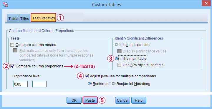
Next, our z-tests are found in the Test Statistics tab shown below.
Completing these steps results in the syntax below.
CTABLES
/VLABELS VARIABLES=marit educ DISPLAY=DEFAULT
/TABLE marit BY educ [COUNT 'N' F40.0, COLPCT.COUNT '%' PCT40.1]
/CATEGORIES VARIABLES=marit ORDER=A KEY=VALUE EMPTY=INCLUDE TOTAL=YES POSITION=AFTER
/CATEGORIES VARIABLES=educ ORDER=A KEY=VALUE EMPTY=INCLUDE
/CRITERIA CILEVEL=95
/COMPARETEST TYPE=PROP ALPHA=0.05 ADJUST=BONFERRONI ORIGIN=COLUMN INCLUDEMRSETS=YES
CATEGORIES=ALLVISIBLE MERGE=YES STYLE=SIMPLE SHOWSIG=NO.
Custom Tables with Pairwise Z-Tests Output
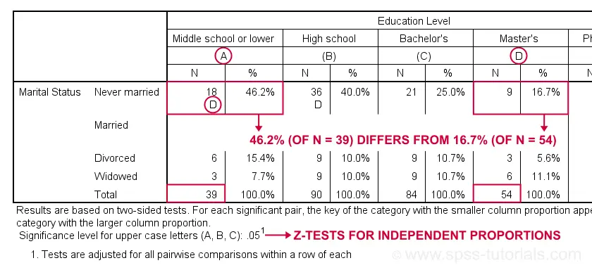
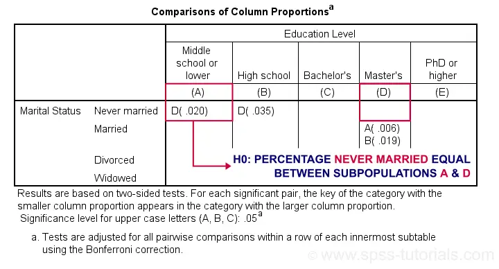
Let's first try and understand what the footnote says: “Results are based on two-sided tests. For each significant pair, the key of the category with the smaller column proportion appears in the category with the larger column proportion. Significance level for upper case letters (A, B, C): .05. Tests are adjusted for all pairwise comparisons within a row of each innermost subtable using the Bonferroni correction.”
Now, for normal 2-way contingency tables, the “innermost subtable” is simply the entire table. Within each row, each possible pair of column proportions is compared using a z-test. If 2 proportions differ significantly, then the higher is flagged with the column letter of the lower. Somewhat confusingly, SPSS flags the frequencies instead of the percentages.
In the first row (never married),
the D in column A indicates that these 2 percentages
differ significantly:
the percentage of people who never married is significantly higher for those who only completed middle school (46.2% from n = 39) than for those who completed a Master’s degree (16.7% from n = 54).
Again, all z-tests use α = 0.05 after Bonferroni correcting their p-values for the number of columns in the table. For our example table with 5 columns, each p-value is multiplied by \(0.5\cdot5(5 - 1) = 10\) before evaluating if it's smaller than the chosen alpha level of 0.05.
Can these Z-Tests be Replicated?
Yes. They can.
Custom Tables has an option to create a table containing the exact p-values for all pairwise z-tests. It's found in the Test Statistics tab. Selecting it results in the syntax below.
CTABLES
/VLABELS VARIABLES=marit educ DISPLAY=DEFAULT
/TABLE marit BY educ [COUNT 'N' F40.0, COLPCT.COUNT '%' PCT40.1]
/CATEGORIES VARIABLES=marit ORDER=A KEY=VALUE EMPTY=INCLUDE TOTAL=YES POSITION=AFTER
/CATEGORIES VARIABLES=educ ORDER=A KEY=VALUE EMPTY=INCLUDE
/CRITERIA CILEVEL=95
/COMPARETEST TYPE=PROP ALPHA=0.05 ADJUST=BONFERRONI ORIGIN=COLUMN INCLUDEMRSETS=YES
CATEGORIES=ALLVISIBLE MERGE=NO STYLE=SIMPLE SHOWSIG=YES.
Exact P-Values for Z-Tests
For the first row (never married), SPSS claims that the Bonferroni corrected p-value for comparing column percentages A and D is p = 0.020. For our example table, this implies an uncorrected p-value of p = 0.0020.
We replicated this result with an Excel z-test calculator. Taking the Bonferroni correction into account, it comes up with the exact same p-value as SPSS.
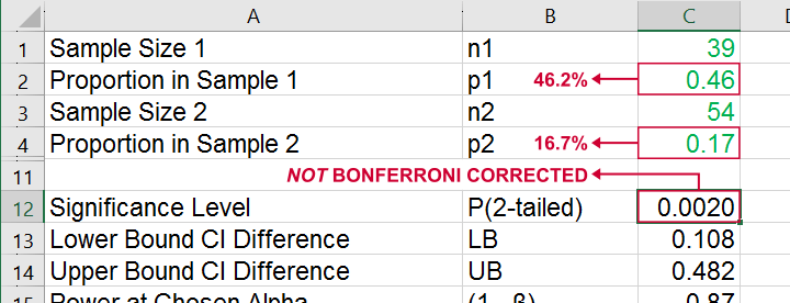
All other p-values reported by SPSS were also exactly replicated by our Excel calculator.
I hope this tutorial has been helpful for obtaining and understanding pairwise z-tests for contingency tables. If you've any questions or feedback, please throw us a comment below.
Thanks for reading!
SPSS Scatterplots & Fit Lines Tool
Contents
- Example Data File
- Prerequisites and Installation
- Example I - Create All Unique Scatterplots
- Example II - Linearity Checks for Predictors
Visualizing your data is the single best thing you can do with it. Doing so may take little effort: a single line FREQUENCIES command in SPSS can create many histograms or bar charts in one go.
Sadly, the situation for scatterplots is different: each of them requires a separate command. We therefore built a tool for creating one, many or all scatterplots among a set of variables, optionally with (non)linear fit lines and regression tables.
Example Data File
We'll use health-costs.sav (partly shown below) throughout this tutorial.
We encourage you to download and open this file and replicate the examples we'll present in a minute.
Prerequisites and Installation
Our tool requires SPSS version 24 or higher. Also, the SPSS Python 3 essentials must be installed (usually the case with recent SPSS versions).
Clicking SPSS_TUTORIALS_SCATTERS.spe downloads our scatterplots tool. You can install it through
![]() as shown below.
as shown below.
In the dialog that opens, navigate to the downloaded .spe file and install it. SPSS will then confirm that the extension was successfully installed under
![]()
Example I - Create All Unique Scatterplots
Let's now inspect all unique scatterplots among health costs, alcohol and cigarette consumption and exercise. We'll navigate to
![]() and fill out the dialog as shown below.
and fill out the dialog as shown below.
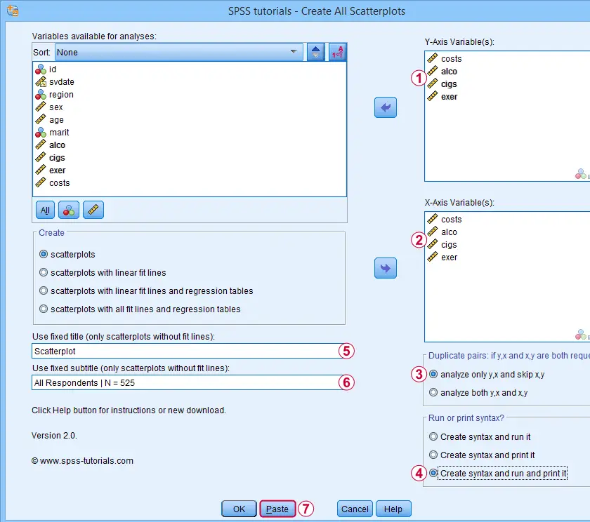
 We enter all relevant variables as y-axis variables. We recommend you always first enter the dependent variable (if any).
We enter these same variables as x-axis variables.
This combination of y-axis and x-axis variables results in duplicate chart. For instance, costs by alco is similar alco by costs transposed. Such duplicates are skipped if “analyze only y,x and skip x,y” is selected.
Besides creating scatterplots, we'll also take a quick look at the SPSS syntax that's generated.
 If no title is entered, our tool applies automatic titles. For this example, the automatic titles were rather lengthy. We therefore override them with a fixed title (“Scatterplot”) for all charts. The only way to have no titles at all is suppressing them with a chart template.
Clicking results in the syntax below. Let's run it.
SPSS Scatterplots Tool - Syntax I
SPSS TUTORIALS SCATTERS YVARS=costs alco cigs exer XVARS=costs alco cigs exer
/OPTIONS ANALYSIS=SCATTERS ACTION=BOTH TITLE="Scatterplot" SUBTITLE="All Respondents | N = 525".
Results
First off, note that the GRAPH commands that were run by our tool have also been printed in the output window (shown below). You could copy, paste, edit and run these on any SPSS installation, even if it doesn't have our tool installed.
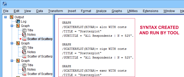
Beneath this syntax, we find all 6 unique scatterplots. Most of them show substantive correlations and all of them look plausible. However, do note that some plots -especially the first one- hint at some curvilinearity. We'll thoroughly investigate this in our second example.
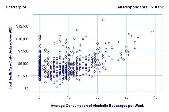
In any case, we feel that a quick look at such scatterplots should always precede an SPSS correlation analysis.
Example II - Linearity Checks for Predictors
I'd now like to run a multiple regression analysis for predicting health costs from several predictors. But before doing so,
let's see if each predictor relates linearly
to our dependent variable. Again, we navigate to
![]() and fill out the dialog as shown below.
and fill out the dialog as shown below.
Our dependent variable is our y-axis variable.
All independent variables are x-axis variables.
We'll create scatterplots with all fit lines and regression tables.
We'll run the syntax below after clicking the button.
SPSS Scatterplots Tool - Syntax II
SPSS TUTORIALS SCATTERS YVARS=costs XVARS=alco cigs exer age
/OPTIONS ANALYSIS=FITALLTABLES ACTION=RUN.
Note that running this syntax triggers some warnings about zero values in some variables. These can safely be ignored for these examples.
Results
In our first scatterplot with regression lines, some curves deviate substantially from linearity as shown below.
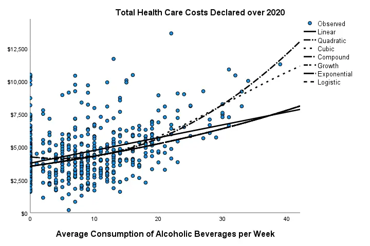
Sadly, this chart's legend doesn't quite help to identify which curve visualizes which transformation function. So let's look at the regression table shown below.
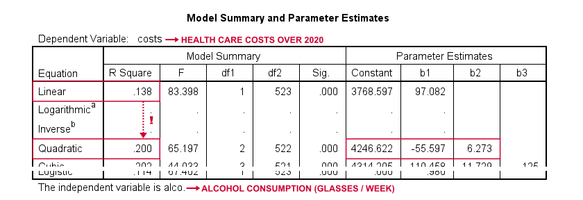
Very interestingly, r-square skyrockets from 0.138 to 0.200 when we add the squared predictor to our model. The b-coefficients tell us that the regression equation for this model is Costs’ = 4,246.22 - 55.597 * alco + 6.273 * alco2 Unfortunately, this table doesn't include significance levels or confidence intervals for these b-coefficients. However, these are easily obtained from a regression analysis after adding the squared predictor to our data. The syntax below does just that.
compute alco2 = alco**2.
*Multiple regression for costs on squared and non squared alcohol consumption.
regression
/statistics r coeff ci(95)
/dependent costs
/method enter alco alco2.
Result
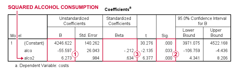
First note that we replicated the exact b-coefficients we saw earlier.
Surprisingly, our squared predictor is more statistically significant than its original, non squared counterpart.
The beta coefficients suggest that the relative strength of the squared predictor is roughly 3 times that of the original predictor.
In short, these results suggest substantial non linearity for at least one predictor. Interestingly, this is not detected by using the standard linearity check: inspecting a scatterplot of standardized residuals versus predicted values after running multiple regression.
But anyway, I just wanted to share the tool I built for these analyses and illustrate it with some typical examples. Hope you found it helpful!
If you've any feedback, we always appreciate if you throw us a comment below.
Thanks for reading!